

Solutions · Brand Identity
Muzi Studio brand identity
After ten years of building brands for other people, the last one we built was our own. The 2016 version was true red on yellow, back when we only did graphic design. Later we added web and technical architecture, and the identity grew a gradient. The 2026 round marks our tenth anniversary.
This project ran on our Brand Identity track. What would the same approach look like on your project?
TypeBrand Identity · Design systemYear2016–2026 (three generations)RoleStrategy · Naming · Identity · Design system · WebsiteScope3 generations · 4 extensions · 9 stops · 33 token blocksStatusActive

The cover is a v10 light field. This one appears only here.
01
/09
ORIGIN
Where it started
In 2016 the studio was called MuziCreative, known in Chinese as Muzi Creative Office, and did only graphic design. That identity was true red on yellow, and the mark was a hexagon standing on the i in place of its dot.
In 2020 the business grew into websites and technical architecture, and the identity changed with it. The background went white, the dot split into four colors, and a violet-to-turquoise gradient appeared for the first time. The same round produced four sub-brands: Creative, Library, Insight and Shop.
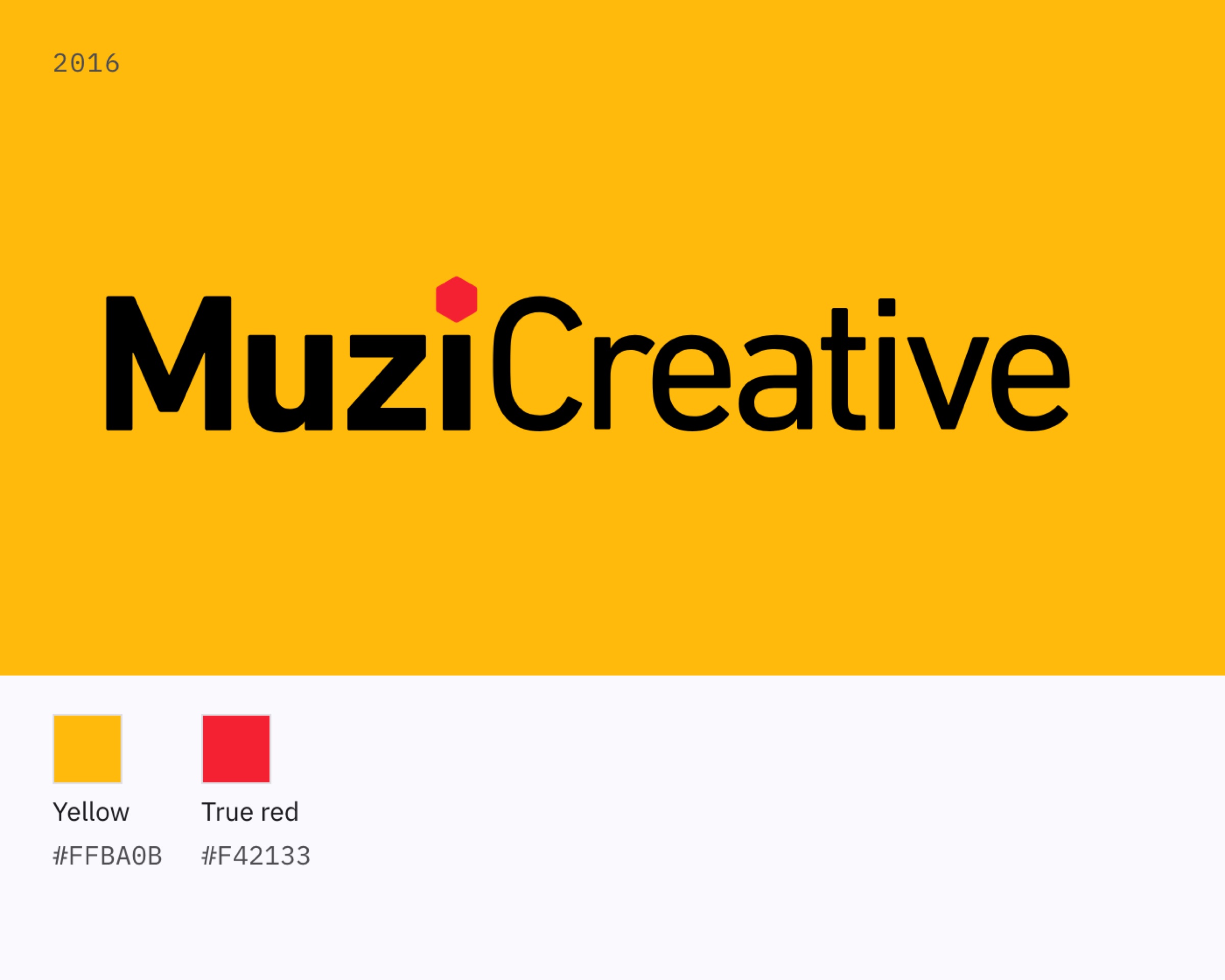
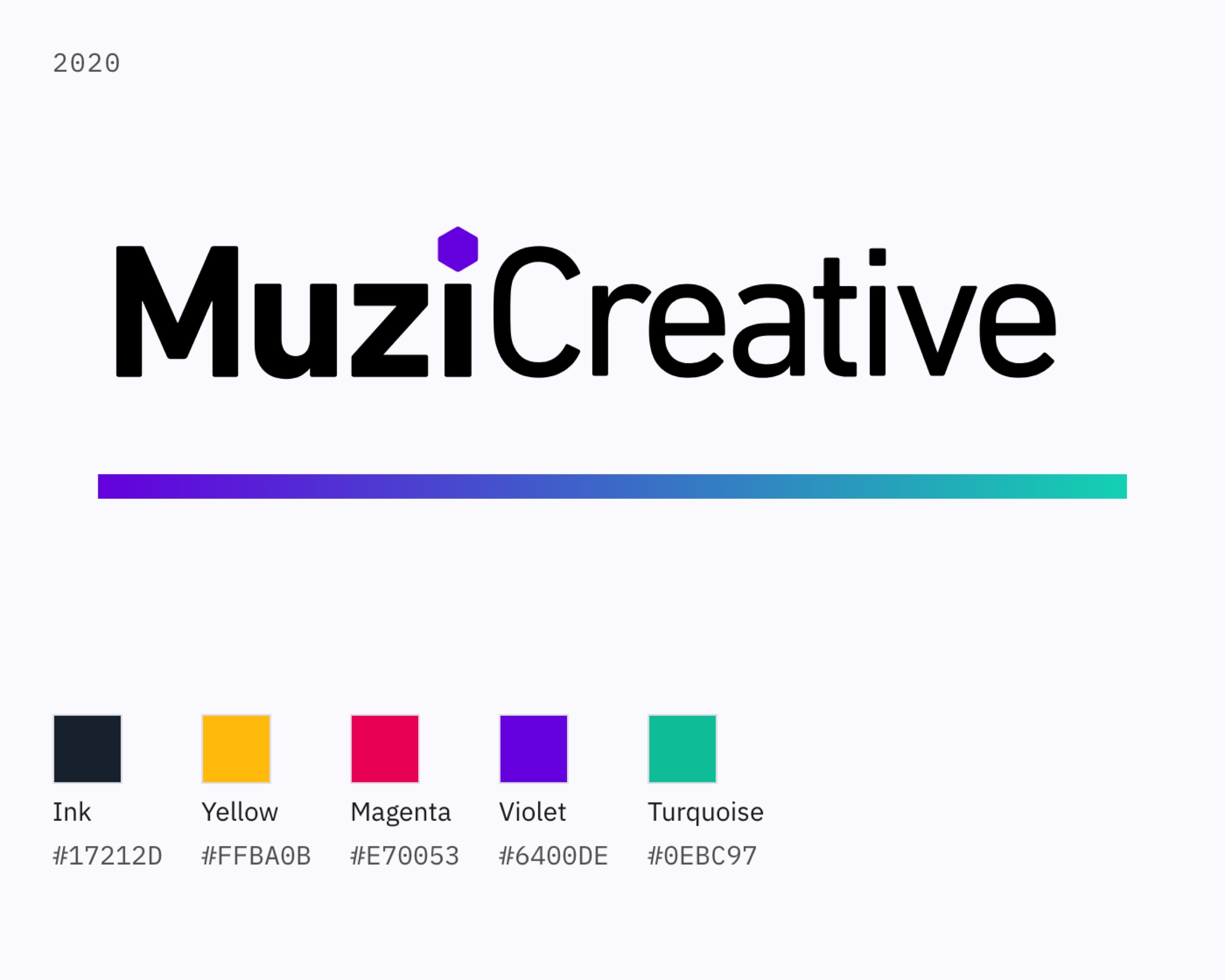
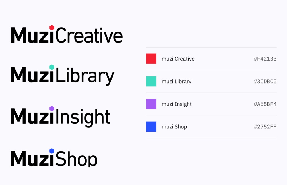
From left: in the graphic-design-only years of 2016, the mark was a single block of solid color. The 2020 gradient band is cropped from a file of the time: two stops, with everything in between left to the renderer. Four sub-brands, four colors, each simply drawn on its own.
The name came before any design decision
The founder’s parents happen to have “forest” and “grove” in their names, one each. Their child was, naturally, Muzi: mu, a single tree. And those three characters are a counting system in themselves.
ForestThree treesGroveTwo treesTreeOne tree
The angle of the tree
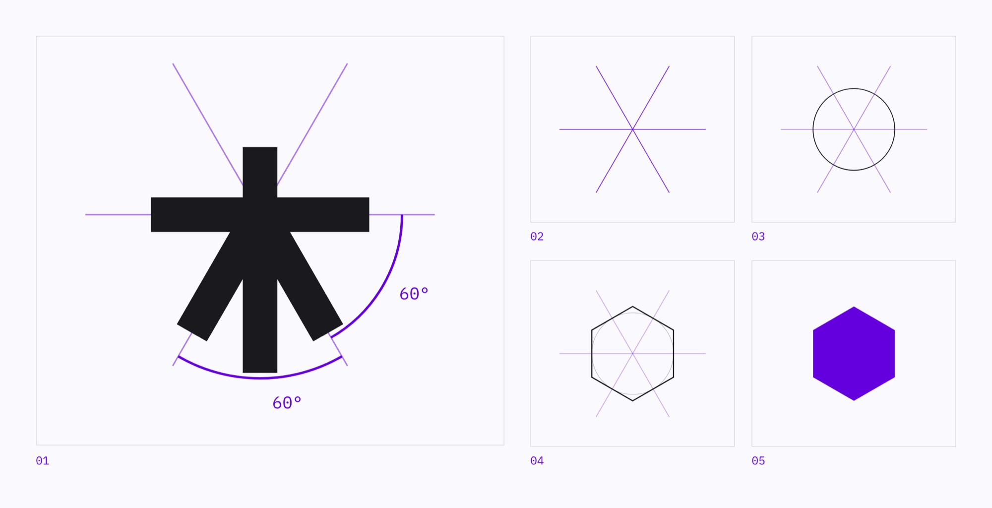
The character gave us the angle; the name gave us the unit. The horizontal stroke and the two diagonals of the tree character fall on one set of 60° axes, and 60° is the angle of a hexagon.
So the mark took the shape that repeats without a gap. The name already had that shape before 2016.
In the 2016 version, the hexagon was already standing on the i, in place of its dot.
02
/09
THE TURN
The turning point
The first two generations were about color. This one is about light.
Two changes, each with its own trigger
The identity never changed for the sake of changing. Both times, the business moved first and the identity followed.
2016MuziCreative (Muzi Creative Office)Graphic design studio2020MuziCreativeAdded web services and technical architecture2026Muzi StudioTechnology and AI growing; the parent brand has to extend
By 2026 this is no longer just a design studio. Technology takes a bigger share every year, and AI has opened up a whole new field. Muzi needed a parent brand that could keep growing outward.
Before finding the new, decide what stays
The colors kept changing because the deliverables kept changing: paper, then screens, then light.
iPosition of the dot60°The hexagon’s angle#6400DEViolet, same value as the 2020 version
Three things stay put: the position of the dot, the 60° angle, and the violet. The 2026 #6400DE is identical to 2020’s, bit for bit.
03
/09
DERIVATION
Construction
This round is the first time in ten years we’ve changed the typeface.
Built up step by step
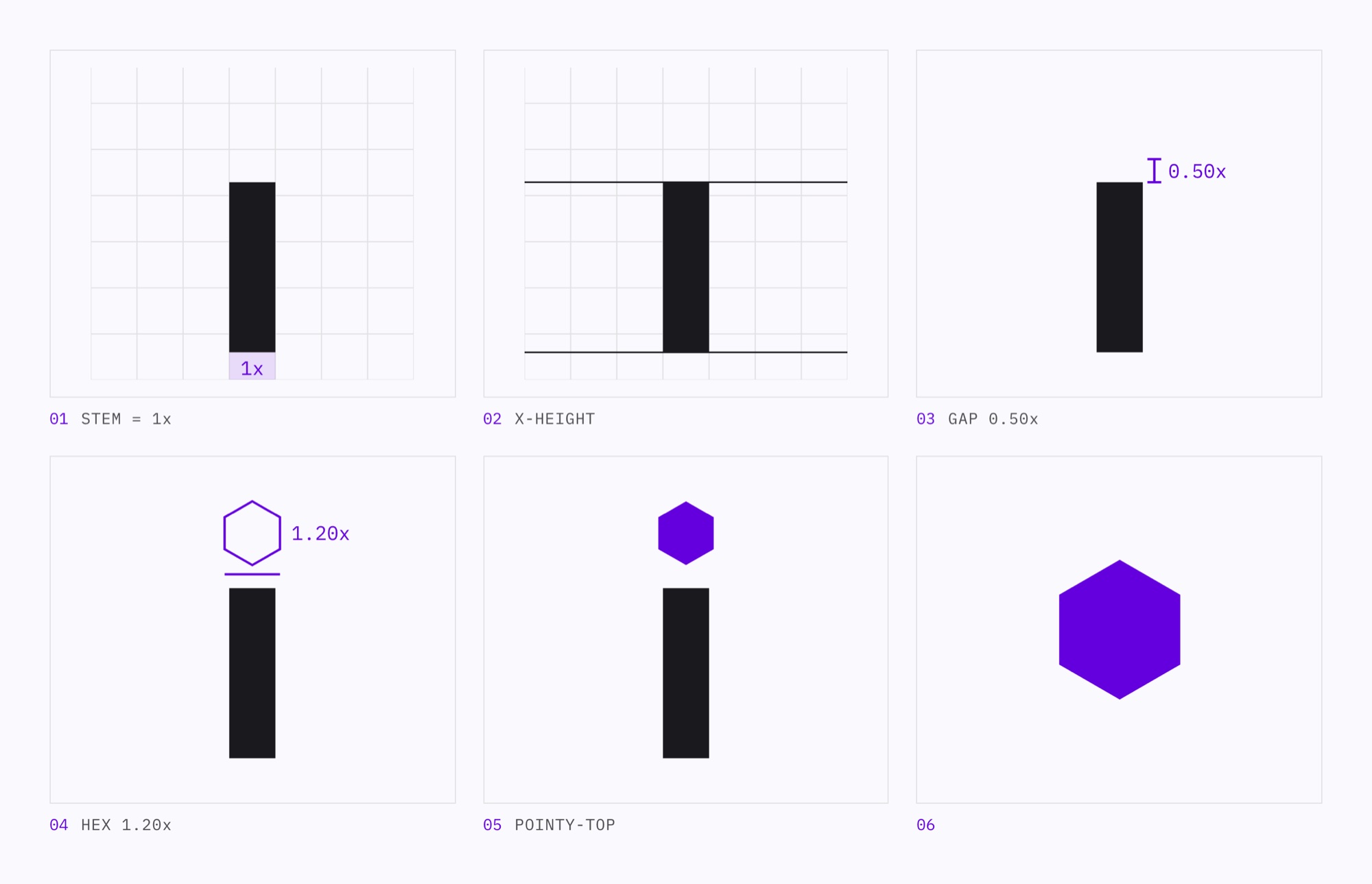
Every proportion comes from a token. This is a construction redrawn from the current geometry, not a process sketch from the time.
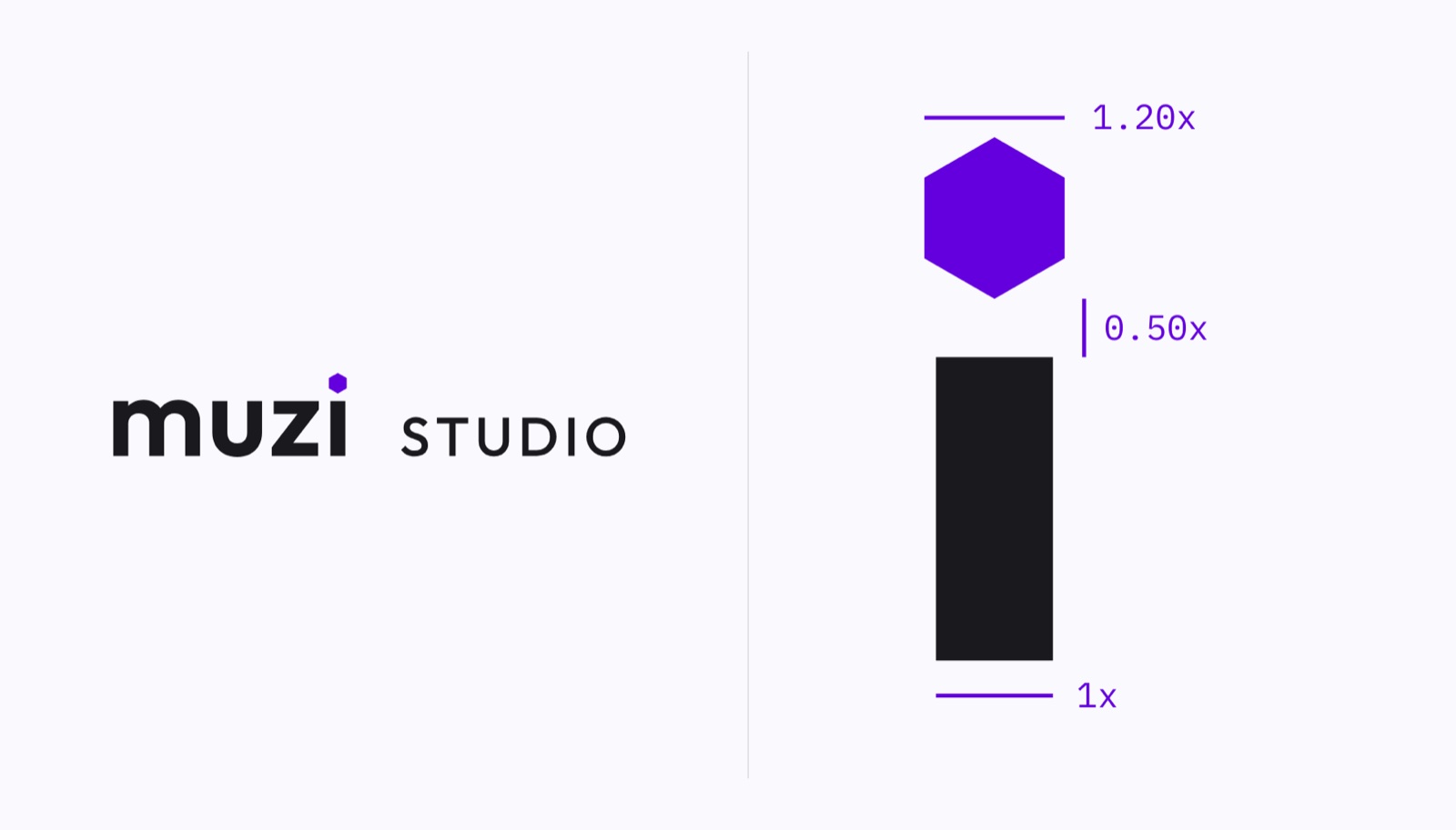
The wordmark uses a dotless i. The dot is the only part of the word that can be swapped out without hurting legibility, so the mark lives inside the name.
ItemValueHexagon width1.20 × stem widthGap above x‑height0.50 × stem widthWordmark tracking+1.5%Descriptor0.70 × x height · 0.1em · 500Optical spacing490.6 units
The most economical of the three
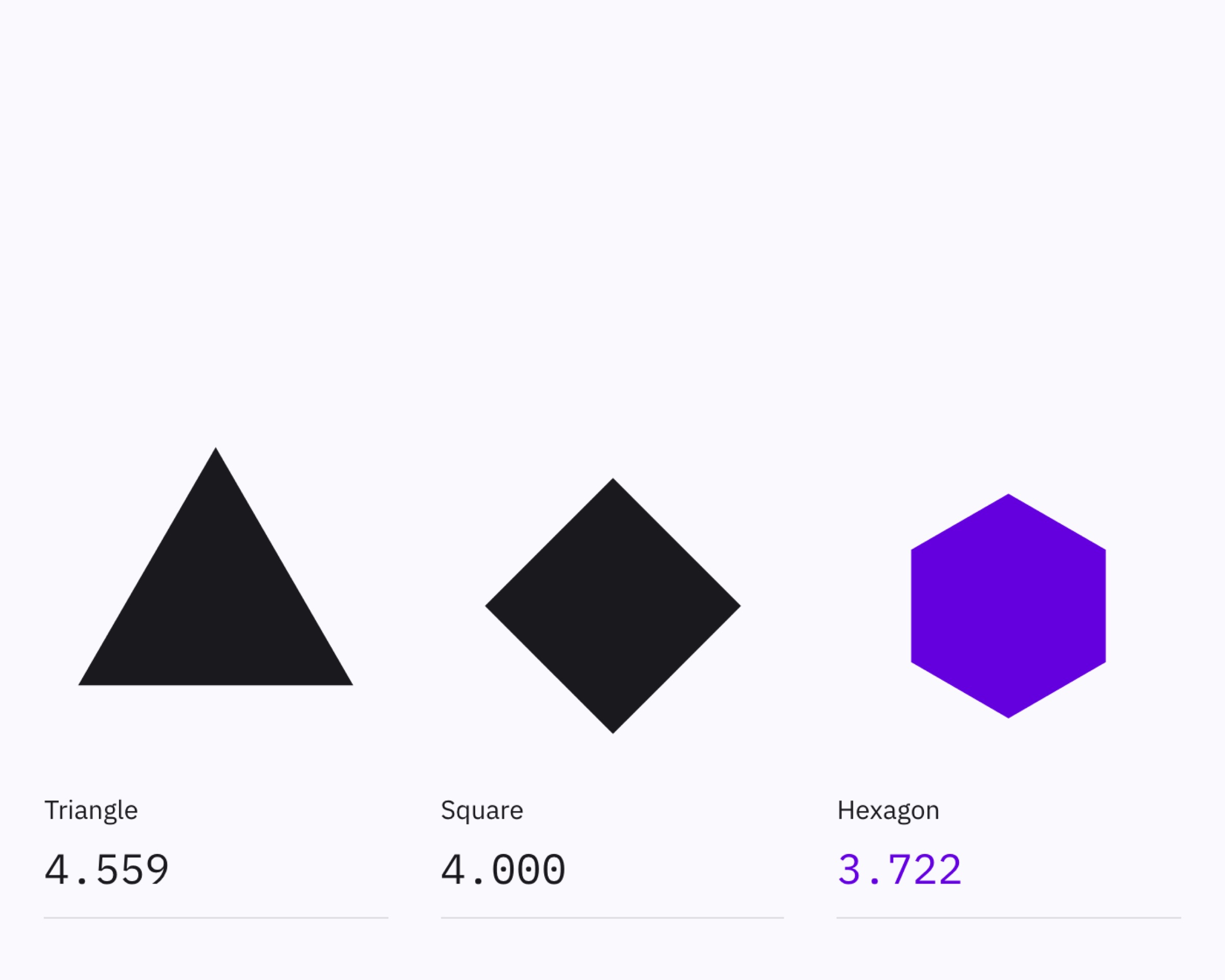
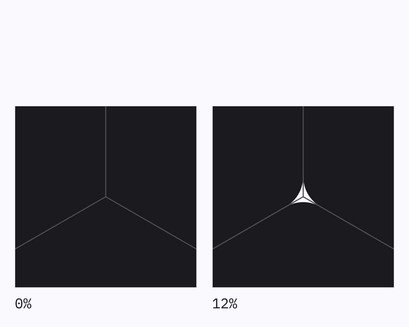
Only three regular polygons tile a plane without gaps. For the same area, the hexagon uses the least edge. That only holds if the corners stay sharp: in testing, a 6% corner radius left a white pinhole at every vertex, and 12% produced visible starbursts.
Everything is measured in stem widths
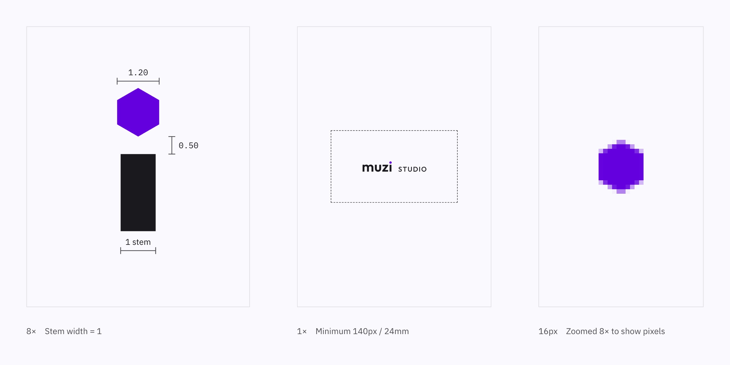
The dot is 1.2 times the stem width and sits half a stem above the x-height line. Change the weight and it grows with it.
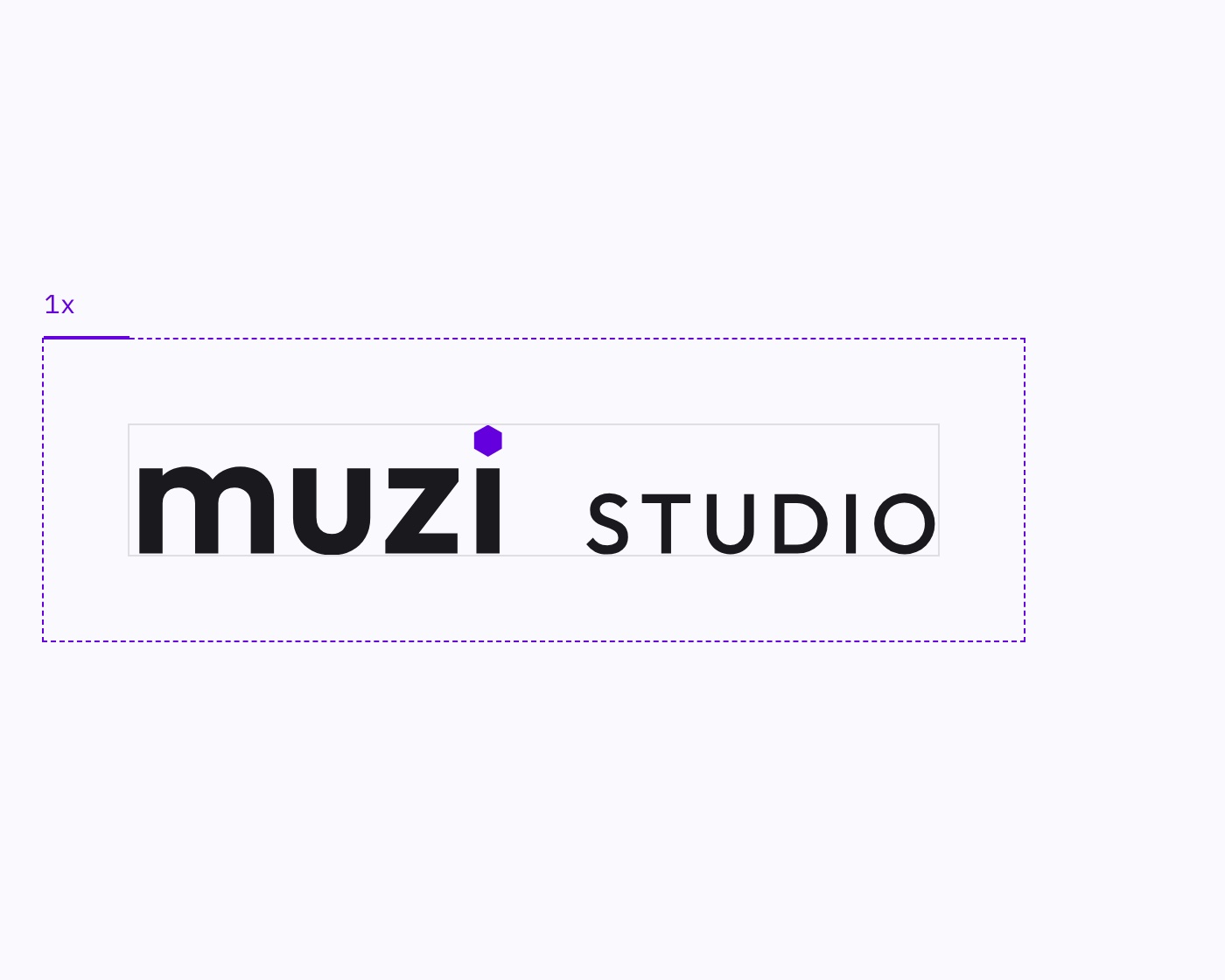
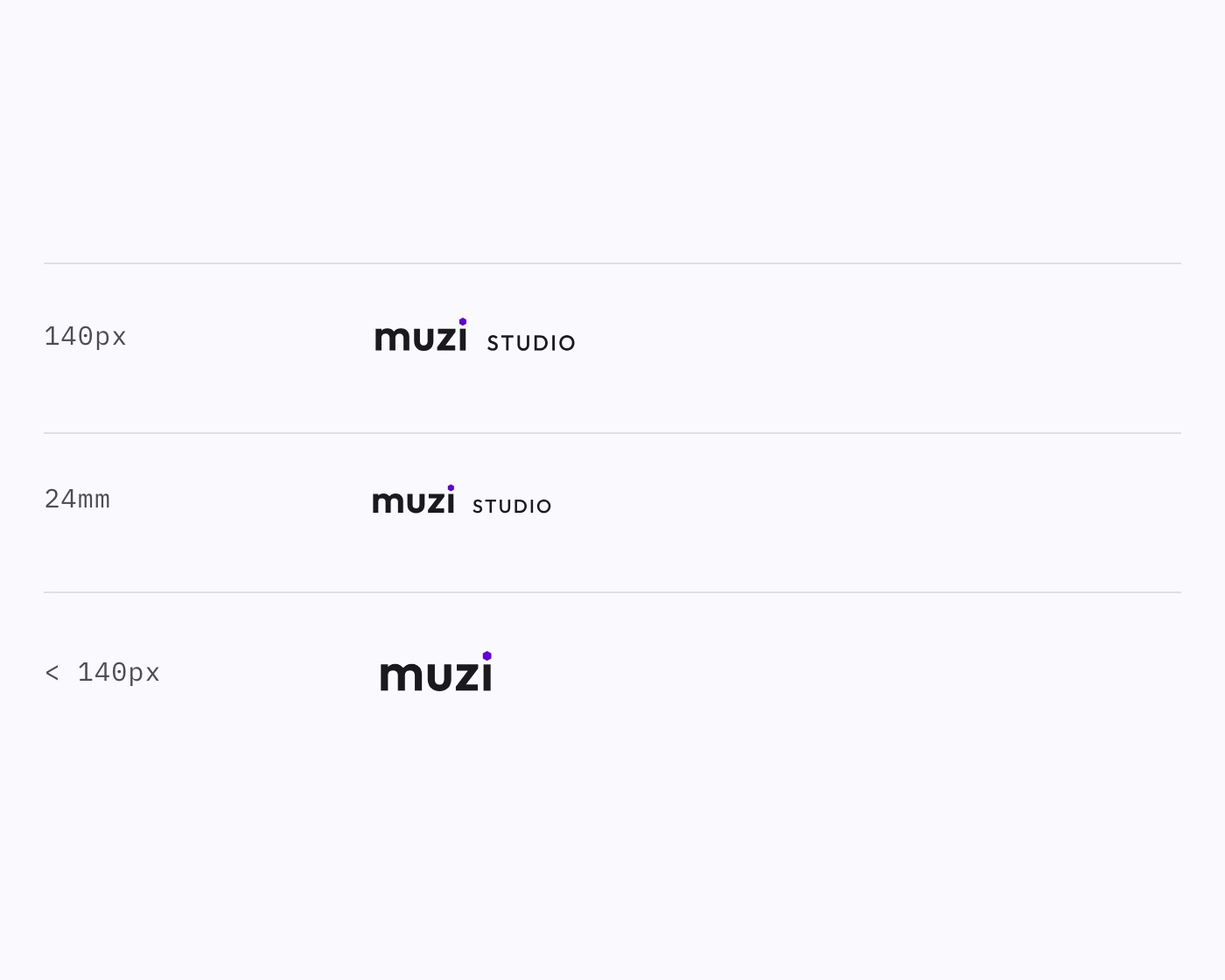
Clear space is one x-height and is already built into the file. The lockup’s minimum size is 140px on screen and 24mm in print. Below that, use the wordmark alone.


The mark is violet on paper, bright violet on dark interfaces, and white on light. Three grounds, one rule: top-left corner only, and no larger than 6% of the frame.
More refined, and you can measure it
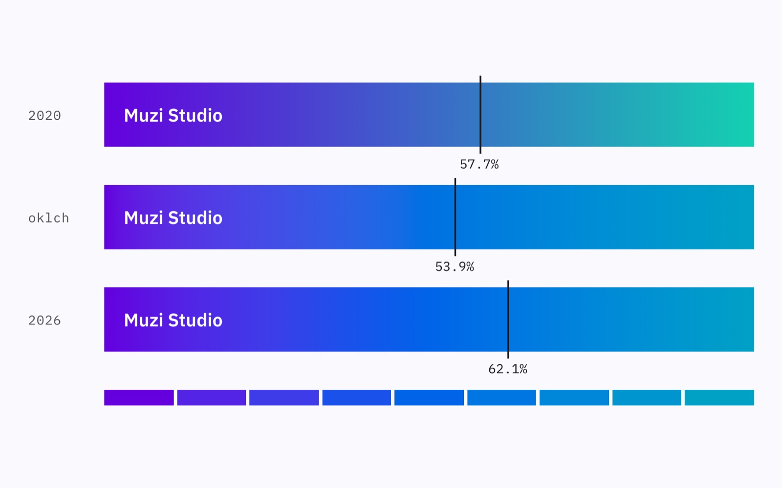
The same gradient went from two stops to nine. Changing the endpoints shortened the safe zone for white text. Easing the lightness won it back, and then some, beyond the previous generation.
ParameterValueInterpolation spaceoklchLightness curvet^1.5Mid-segment chroma+0.03Hue pathshort_arcStops9
PositionColor0.0%#6400DE12.5%#5324E525.0%#3E3CE937.5%#1A51EB50.0%#0064E862.5%#0076E275.0%#0087D987.5%#0095CF100.0%#00A1C5
Ten years, three generations, and the dot never moved
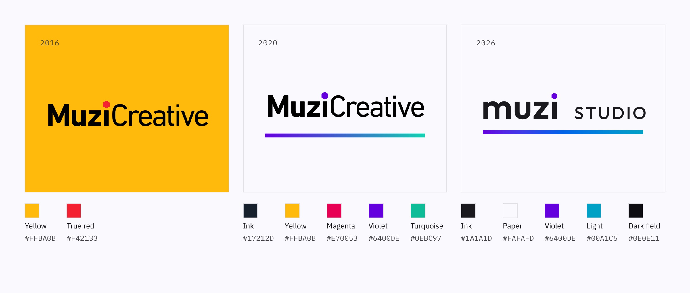
Colors, typefaces and media changed. In ten years, the hexagon’s position and shape never moved once.
04
/09
THE SYSTEM
The system
What we delivered this round is a rule: when the next business line plugs in, nothing has to be redone.
What we delivered is a rule
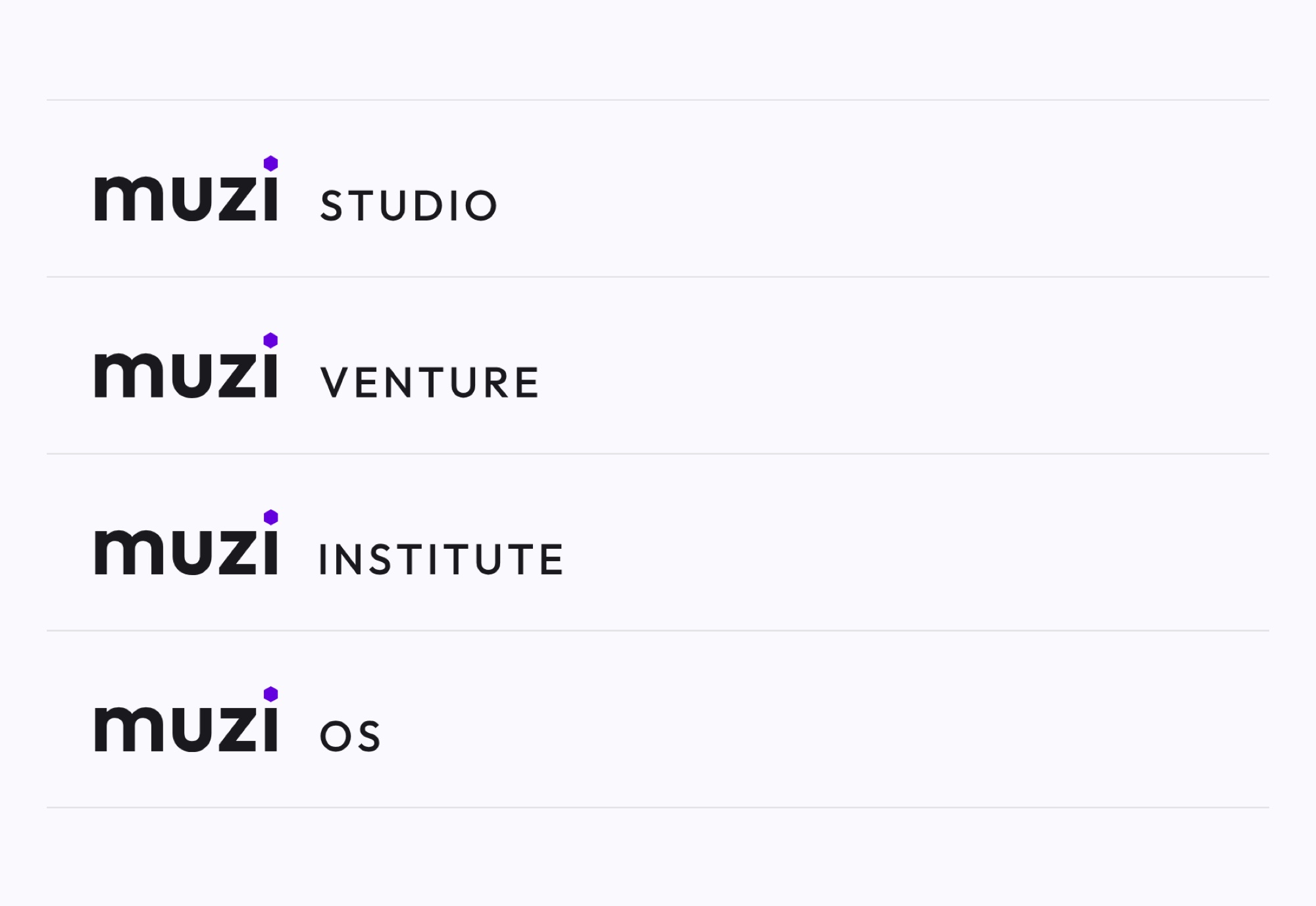
Give it any suffix and it derives a valid lockup. Seven constants, one variable, four prohibitions, and a generator that works it out.
Try a name that doesn’t exist yet. Which businesses AI will open up is still hard to say, so the rules have to be ready to catch them.
Constants7Wordmark outline (muzı as a path) — never redrawnHexagon shape, orientation (pointy-top), sharp cornersHexagon proportions relative to the stem (1.20× / 0.50×)Wordmark tracking +1.5%Four descriptor parameters (0.70× / 0.10em / shared baseline / 500)Optical spacing 490.6 unitsViolet appears only in the hexagon, the one color event on the whole siteVariable1The slot word itself (studio / labs / …): any length; optical spacing absorbs itProhibitions4Setting the slot word in lowercaseRecoloring the slot word (use color twice and the hexagon stops being the only mark)Changing the wordmark, hexagon or proportions for a sub-brandAdding a second brand color for a sub-brand
Chinese never stands alone
The wordmark leads in English. Chinese and Japanese sit on a smaller second line, with space between the two.

The studio’s Chinese name, which reads “Muzi Studio,” is tracked out to the width of “muzi.” The Japanese name is Muzi Kōbō, “Muzi workshop.” The parent brand is simply Muzi.
Parent brand and studio
Muzi is the company; muzi studio is one business line under it. The parent brand uses only paper and ink, violet only on the dot, and a nine-stop gradient bar along the top edge. The studio doesn’t draw that bar. Its color lives in the light.
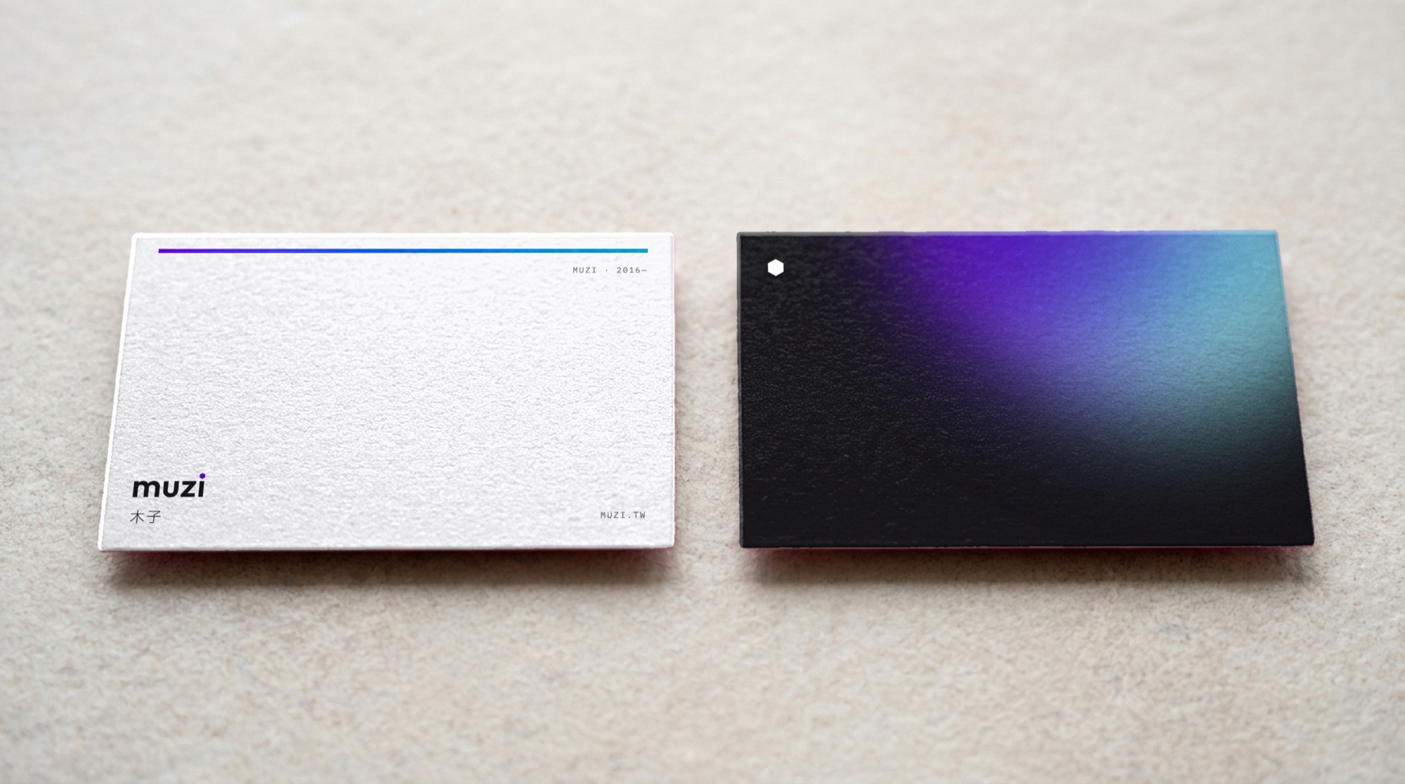
One color, two states. Left: the parent brand’s gradient bar, as thick as the wordmark’s stem and held within the text margins. Right: the back of a studio business card, with a white mark on light in the top-left corner.
Color comes only from light
The surface has a single neutral scale, seven steps from paper to ink. Every other color is sampled from the light: three points, violet, blue and cyan. Text on light comes in just three grays. The color order for data visualization comes from the same gradient.
paper#FAFAFD16.7:1mist#DFDFE313.1:1steel#4D4D508.1:1ink#1A1A1D16.7:1field#0E0E11Light-field shadowgradient9 stopsoklchviolet#6400DE0%blue#0064E850%cyan#00A1C5100%text#FFFFFF · 19.27:1text-muted#9D9D9F · 7.12:1text-subtle#7A7A7D · 4.5:1
Type, components, and icons
Eight steps in the type scale, and not one more. Outfit is for the wordmark only; body and headings are always IBM Plex. Having icons is nothing special. Having a method for making them is what makes a design system.
display-1 · 76/1.02muzi studiodisplay-2 · 40/1.14Light spills in from one sidetitle · 24/1.32The hexagon stands on the i as its dotlead · 21/1.58The first two generations were about color. This one is about light.body · 17/1.75Each light field is used once; its number is in the caption.small · 15/1.65The start point hasn’t moved by a single bit; the end point is derived.caption · 13/1.6SEED 4471 · Light from upper right · Hue 231°label · 11.5/1.9PAPER · FIELD · 1/1
Start a projectStart a projectStart a projectStart a projectStart a projectdefaulthoverfocus-visibleactivedisabledCompany nameMuzi StudioEmailmuzi@Incomplete addressBrand IdentityWebsiteSEED 4471231°Median hueFIELD · 1/189.8%Dark-area share
arrow-rightarrow-leftarrow-uparrow-downchevron-rightchevron-downcloseaddminuscheckcopydownloadexternallinkmenusearchmailplaypausealertinfo
05
/09
ALIVE
A living identity
An identity can be a set of files, or it can be something that grows. This round we wanted the second: fixed rules, a different instance every time.
A single subject
The risk with anything that grows is that it stops being recognizable, so half of it stays fixed on purpose: the dot, the type, the palette, the icons, the component states. The other half is handed to the light.
Light fields are for screens, spaces, covers and merch. Paper texture is for anything meant to be read through. Every piece belongs to exactly one side.
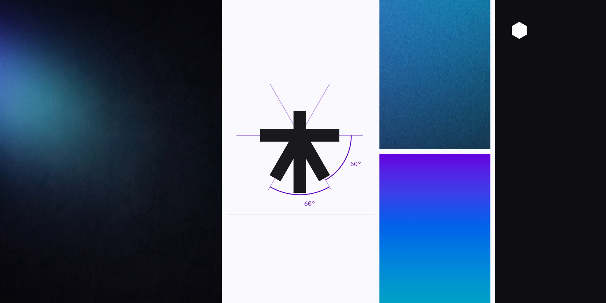
Light, dark field, grain, a gradient washing across the whole frame, 60°.
What we said no to
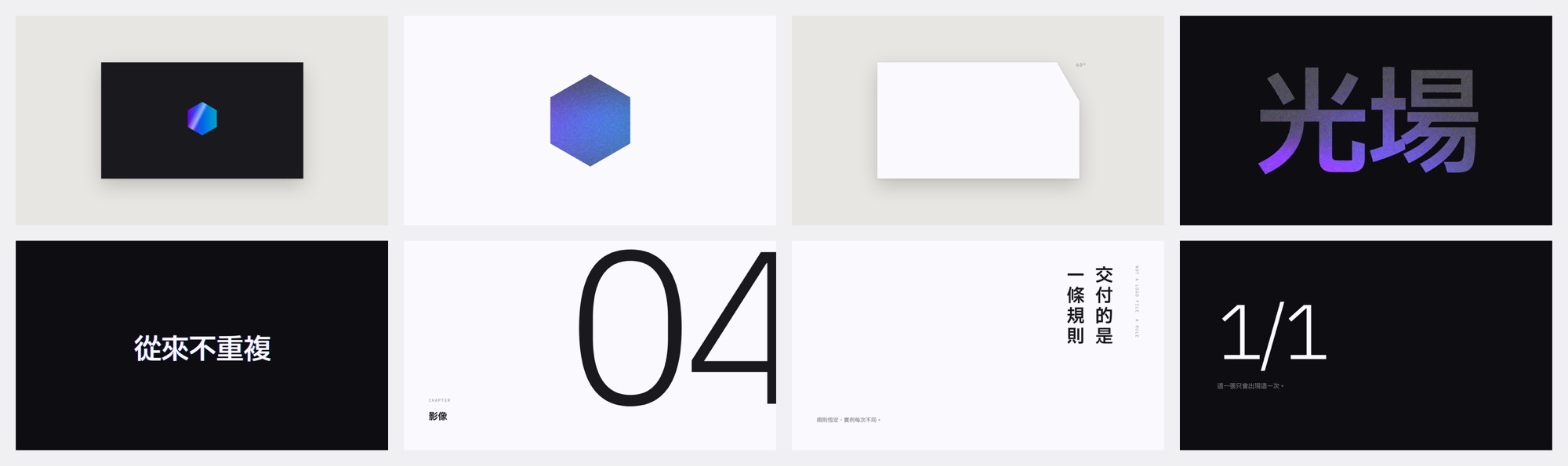
Eight rejected directions. Top row: two with a centered hexagon, a business card with a clipped corner, light filling the letters. Bottom row: large type on black, giant section numbers, vertical text, a fraction as the hero.
The mark is an accent, not the hero, so every centered hexagon was out.
Large type isn’t baked into images: text has to be selectable and translatable. That ruled out light-filled letters, big type on black, and the fraction as hero.
The clipped-corner card belonged to the object-and-texture direction. Vertical text and giant section numbers belonged to the editorial-layout direction. We passed on both directions entirely.
Each one appears only once

A single sheet of gradient light washes in from outside the frame. The dark areas are empty, and the grain feels tactile. There’s no form, so it can be cropped anywhere without breaking.

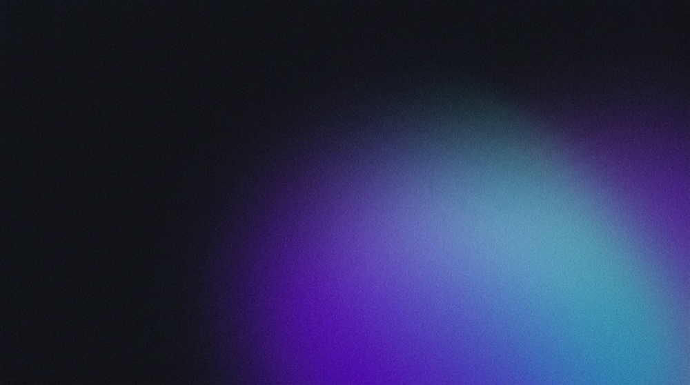
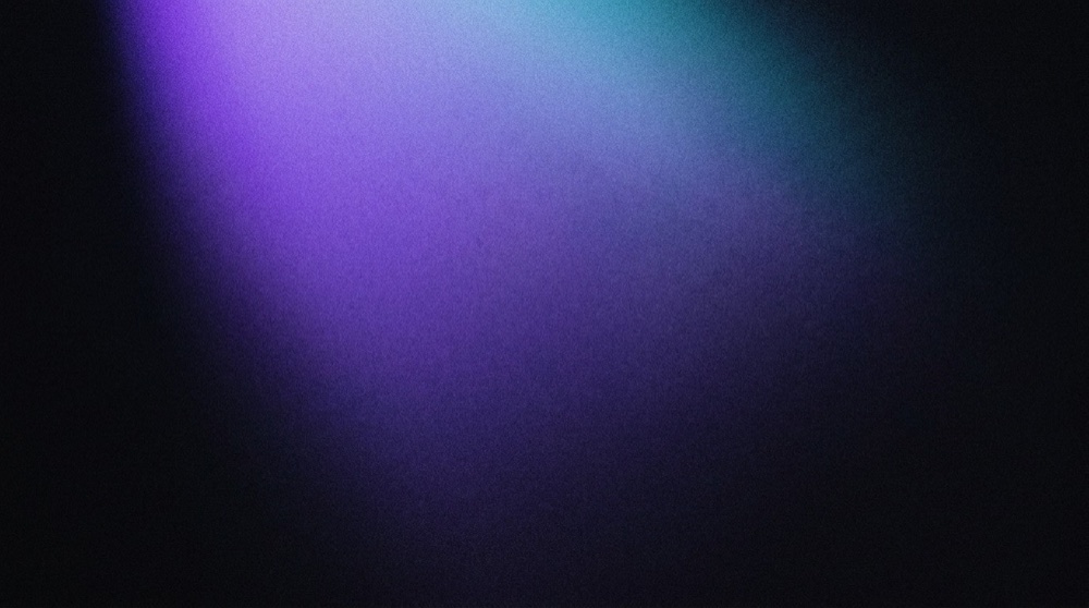
Six images generated by the same rules. Each piece of collateral claims one, the ledger records it, and it’s never issued again.
How the light is generated
A seed decides which edge the light enters from, how much it covers, whether it leans violet or cyan, and how quickly it falls off. The same seed always grows the same image. Change the seed and you get another.
01SeedEvery image has its own number, and the same seed always rebuilds the same image.02SamplingWhich edge the light comes in from, how much it covers, how it fades, how coarse the grain is. 03ModelA fixed style section plus this run’s variation.04ContractMeasured on 12 axes; anything clearly out of bounds is stopped here.
 05Human eyeIs the shape right? Only what a person has seen goes on the allowlist.06LedgerEach claim is logged. Never reused.
Measure it first
Hue and dark-area share are the brand’s signature, so their bounds are narrow. Where the light sits and how big it is get wide bounds. Anything out of bounds is redrawn.
Median hue202 – 252SignatureDark-area share0.668 – 0.933SignatureHue span46 – 66SignatureMedian chroma0.414 – 0.762FreeGrain energy0.0003 – 0.0006FreeBright-area spread0.312 – 0.767FreeEdge energy0.0011 – 0.0028FreePeak lightness0.160 – 0.426FreeBright centroid x0.320 – 0.849FreeBright-area count1.000 – 2.000FreeAverage lightness0.033 – 0.095FreeBright centroid y0.163 – 0.818Free
Then a person looks again
The contract can’t measure “looks like a thing.” Beams, orbs, text growing inside the image: a person looking caught every one of them. Only what has been reviewed goes on the allowlist, which now holds 45 images.
26 imagesSamples used to calibrate the contract0.111Closest pair, composition distance1.387Median pairwise distance
 Beams
Beams Orbs
Orbs Auroras and waves
 Text growing from the image
A single light
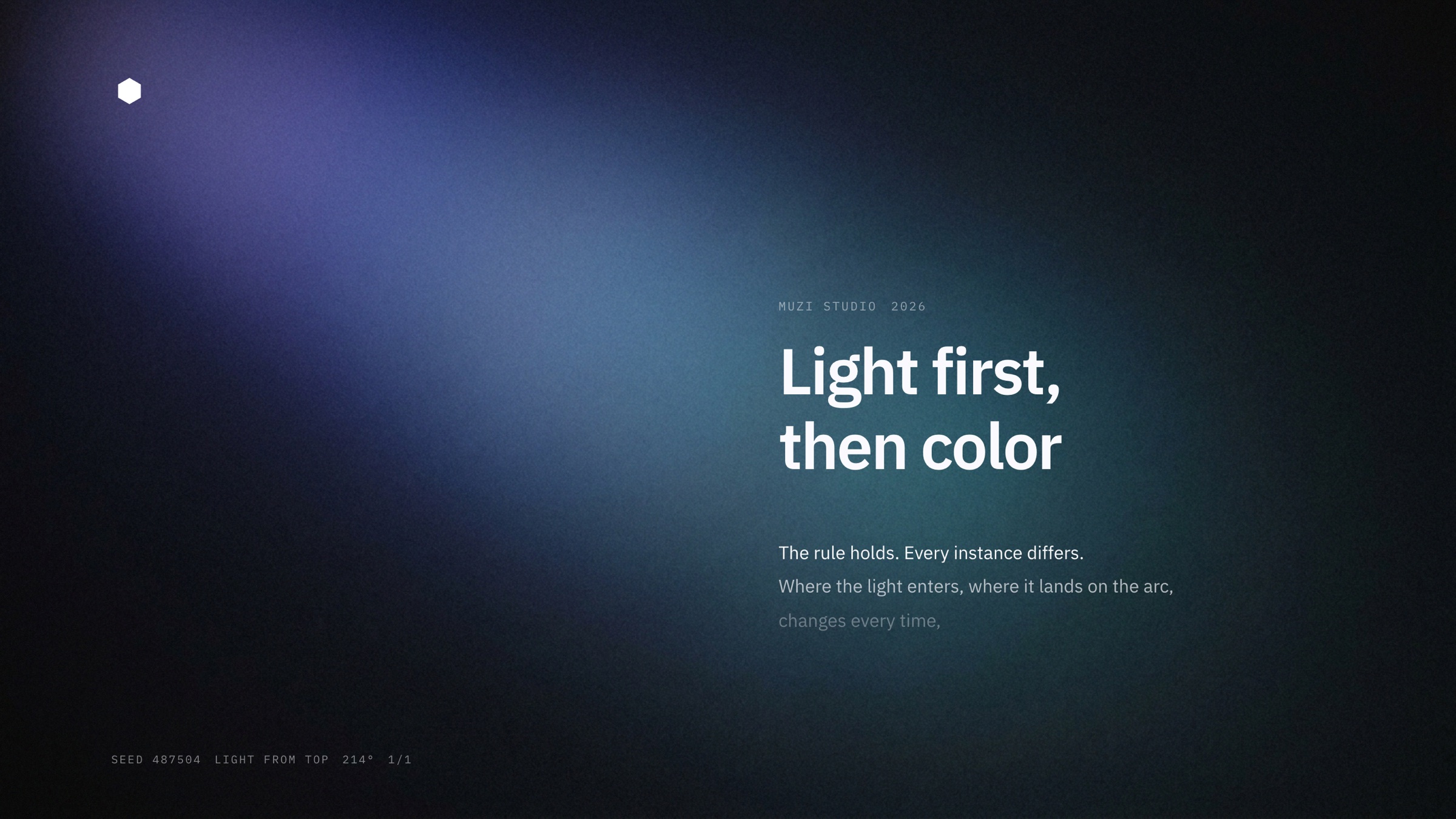
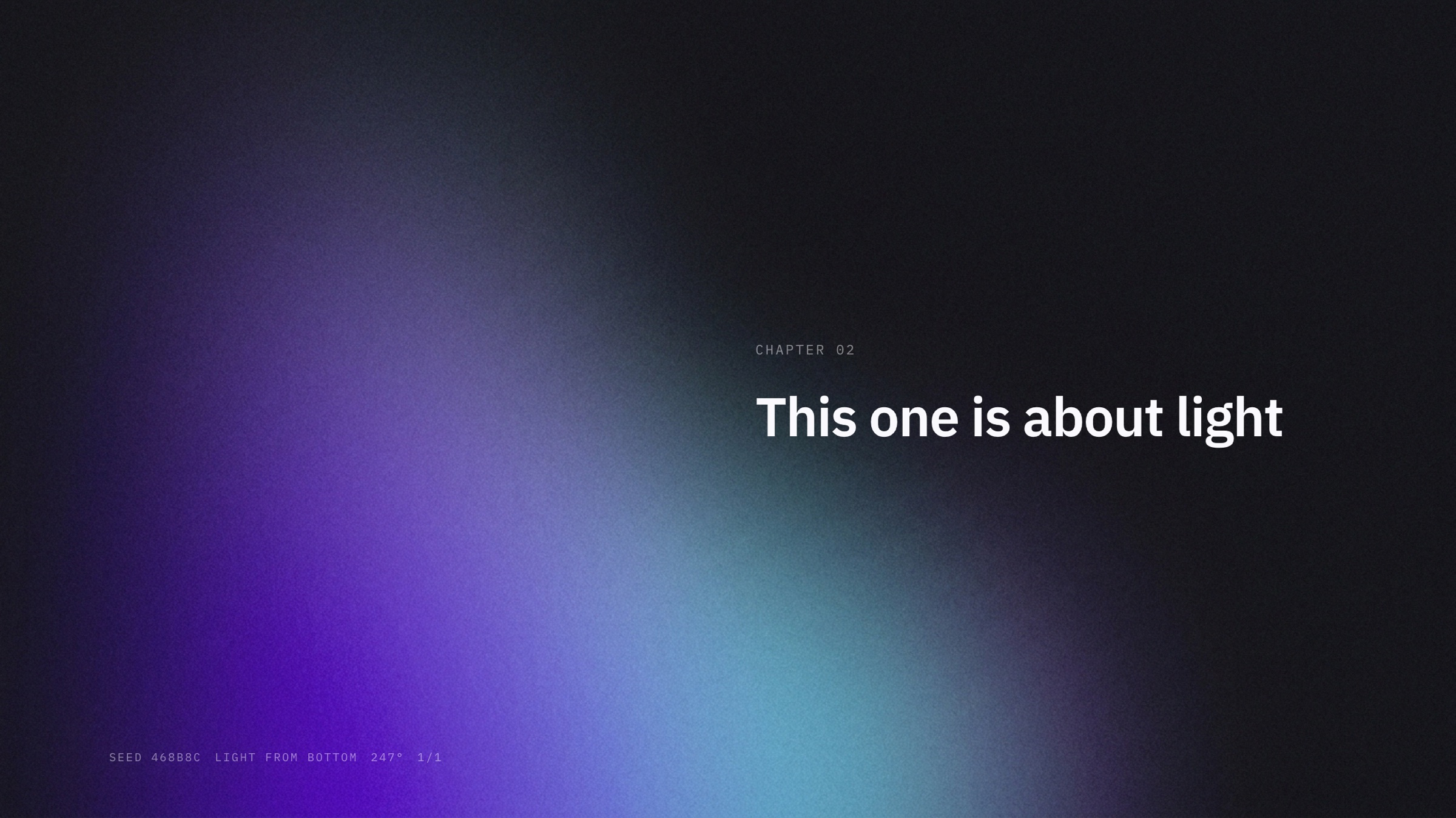
Wherever the light is, the type goes on the other side, and body text gets darker the farther it sits from the light. Every piece is numbered in the corner: seed, light direction, hue, 1/1.
One light, two versions
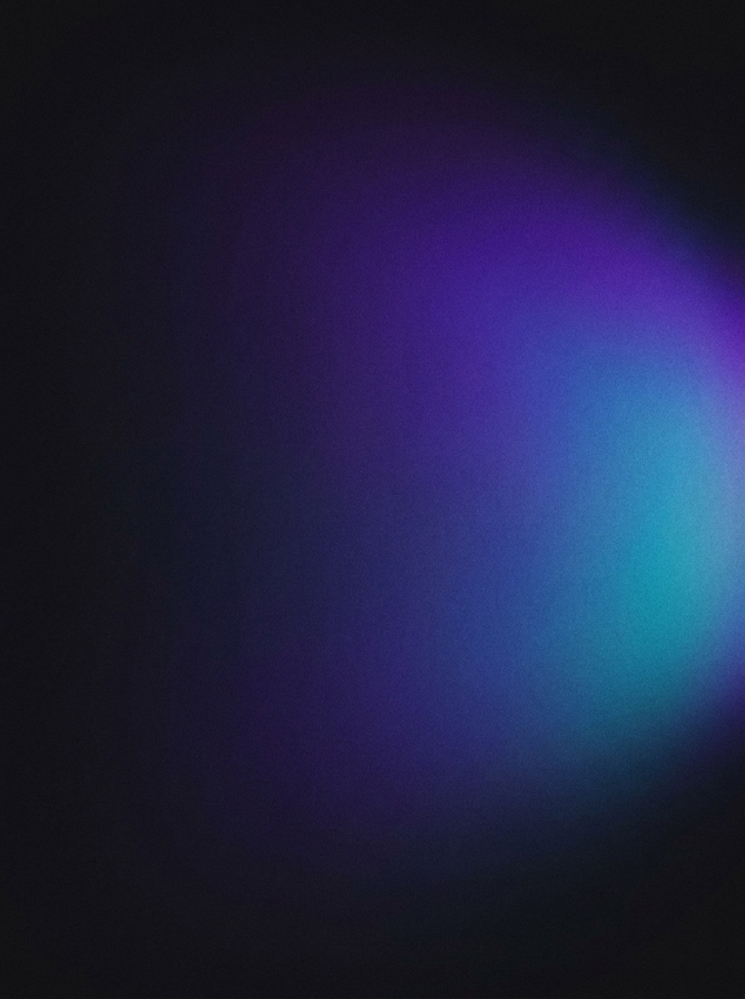
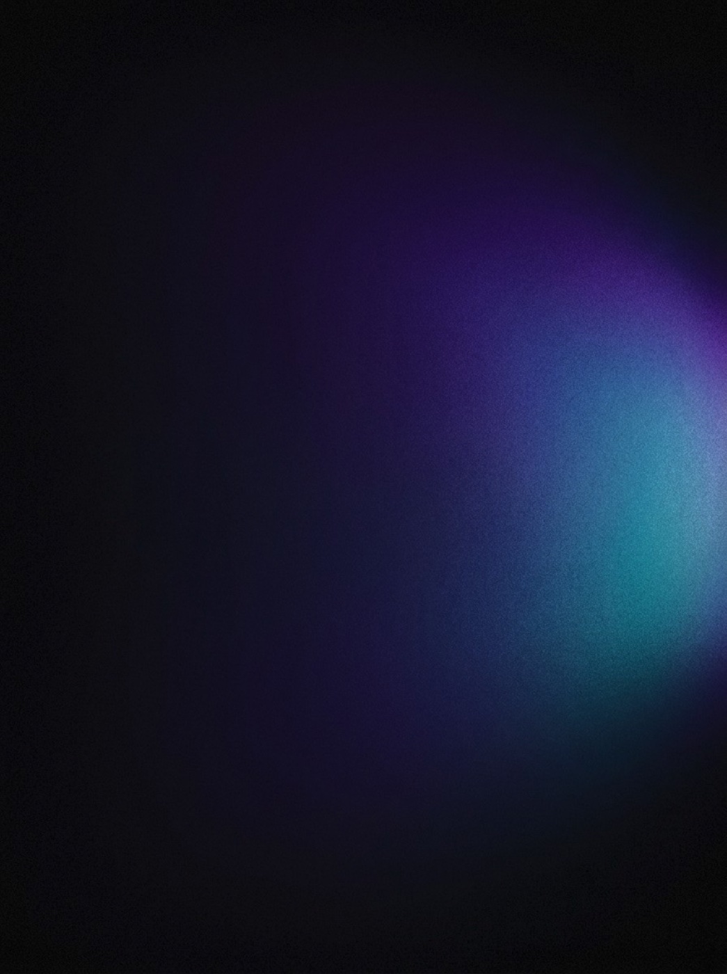
Left is for collateral. Right is for the website: the whole image is pulled down, the light buried in the dark, and the bright areas come out even more saturated. Backgrounds on muzi.tw always use the right-hand version.
Three lanes running at once
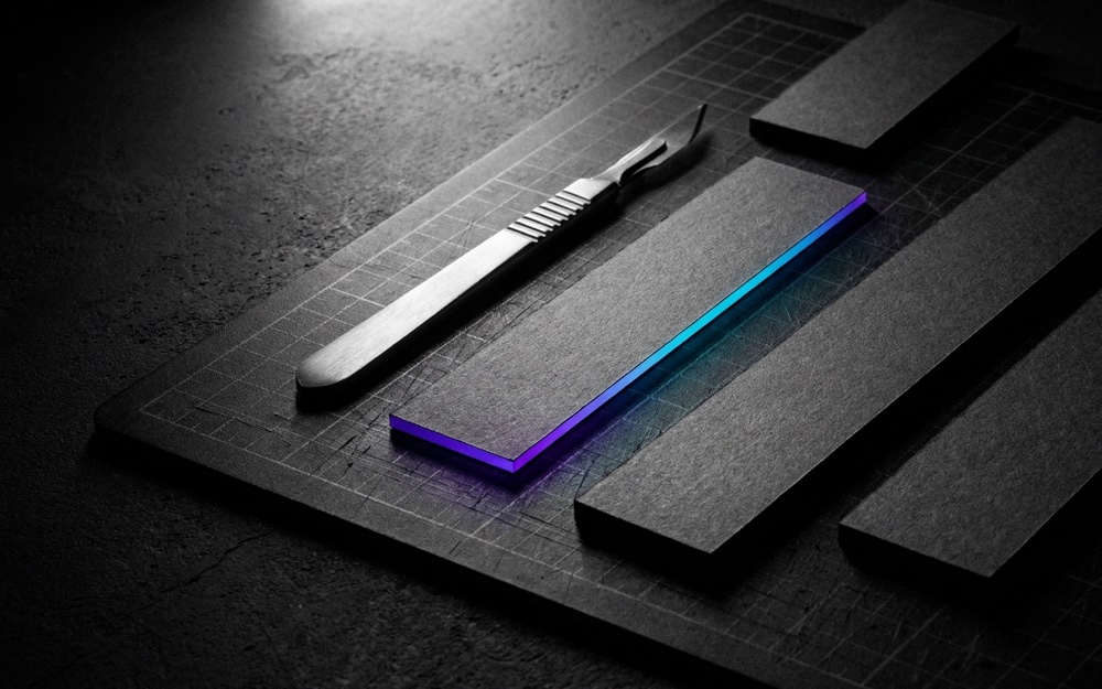
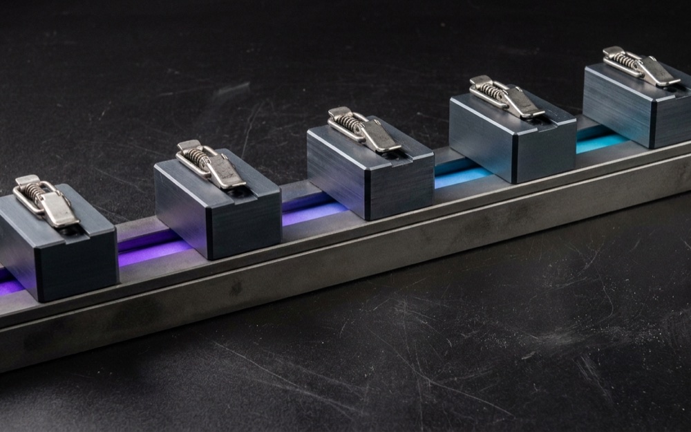
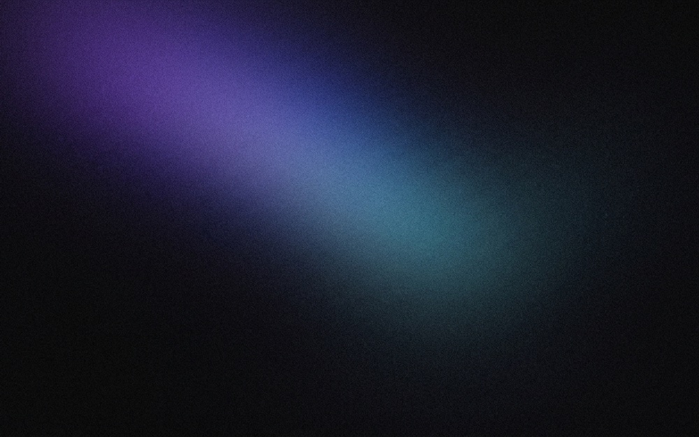
The dividing line is the subject: one lane shoots material, one shoots structure, one shoots only light. All three share one set of rules, each answers a different question, and none replaces another.
06
/09
IN USE
Put to work in different places
One set of rules, eight settings. Every piece has a light behind it that’s used only once.
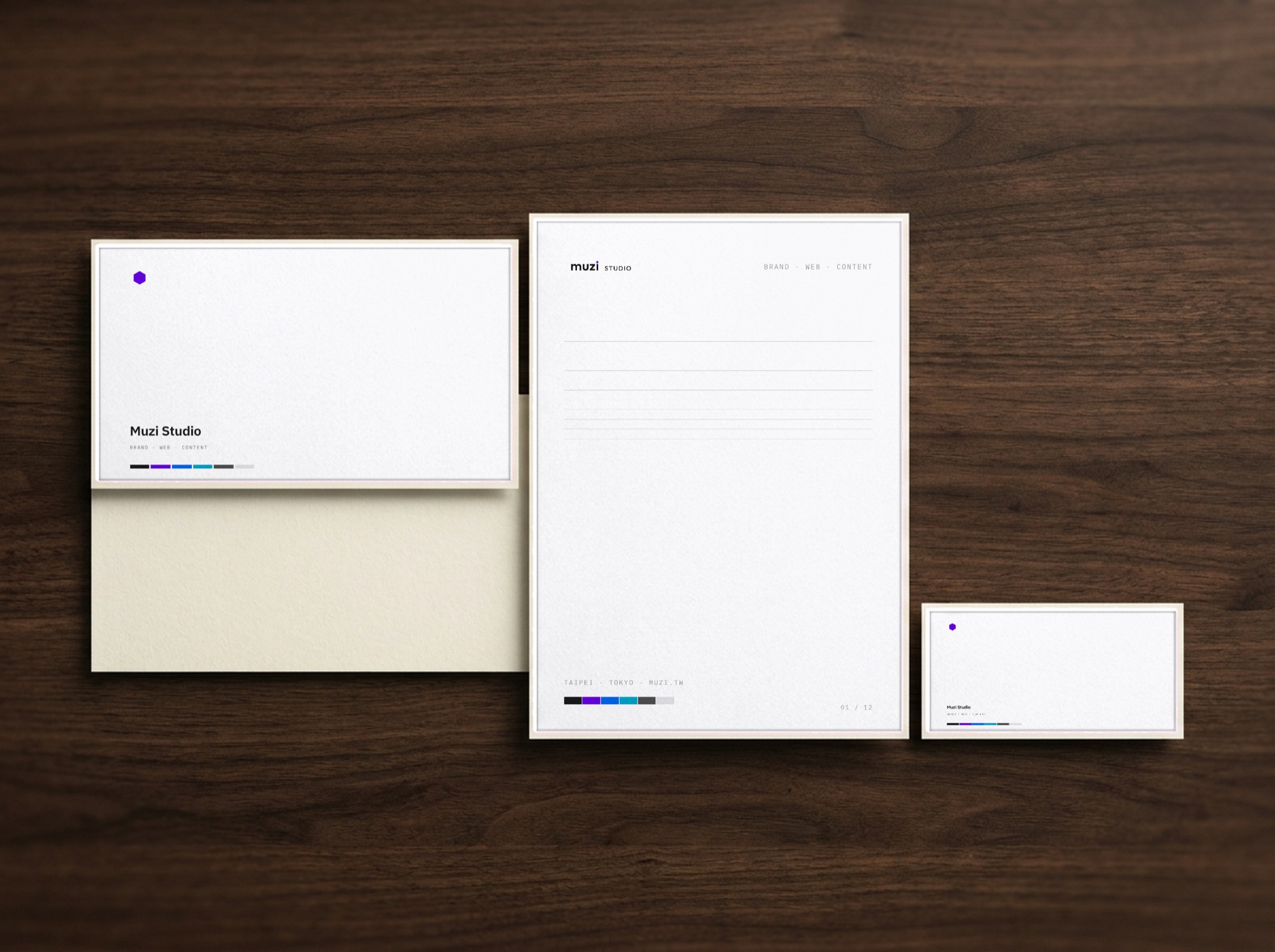
The flat artwork was laid out in code, every pixel from the vector source files. The scenes are empty photos generated by a model. At no point did the model draw the mark.
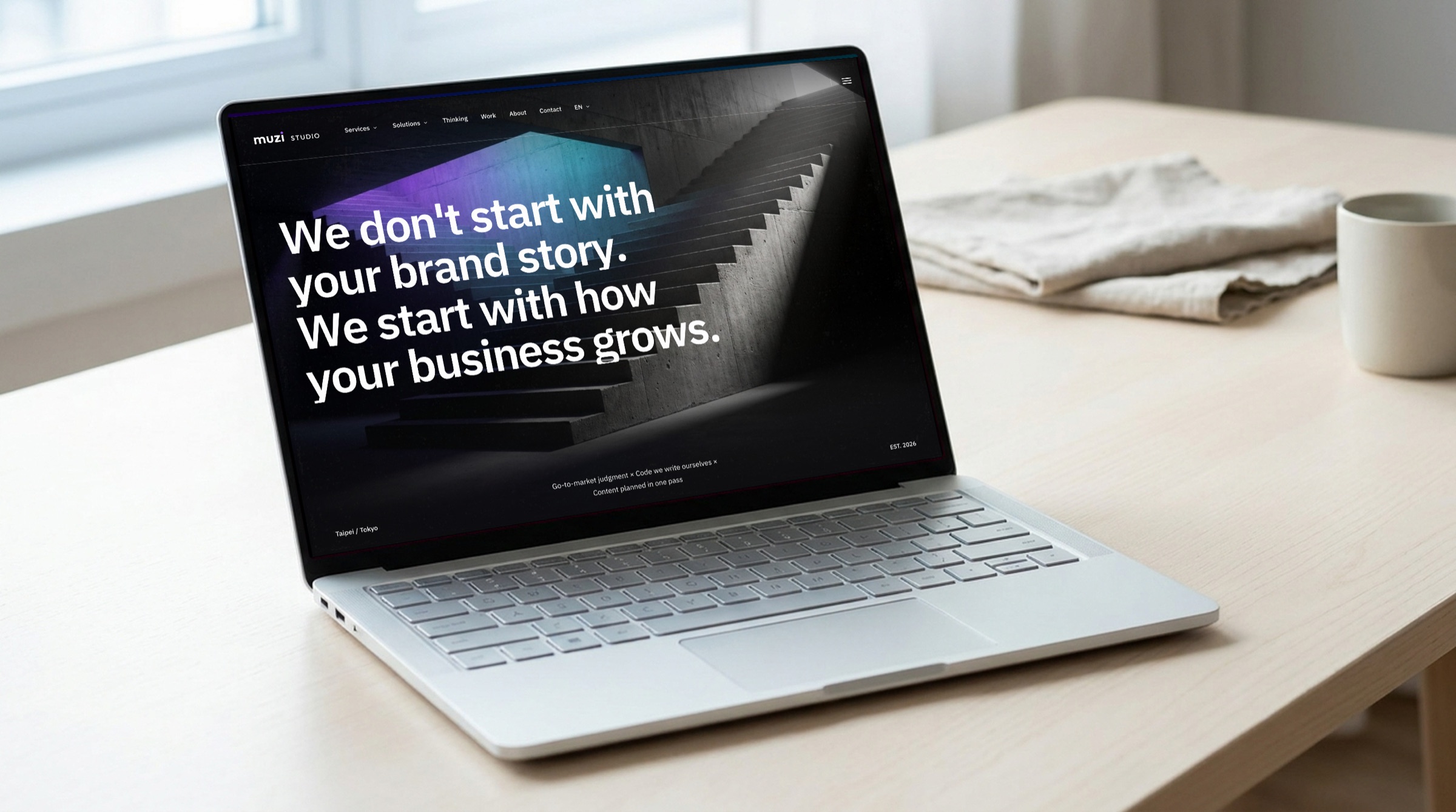
The screen shows the muzi.tw homepage.
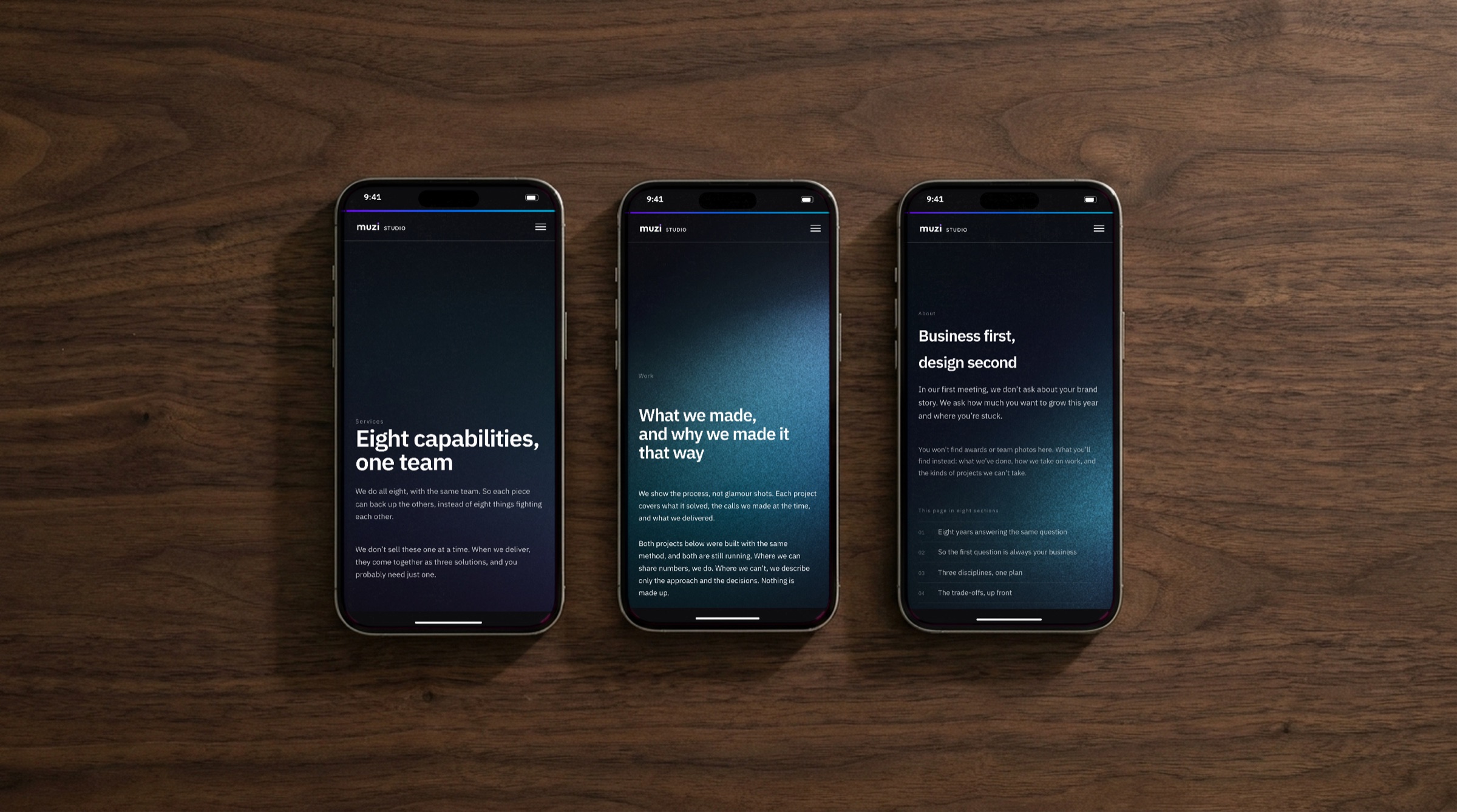
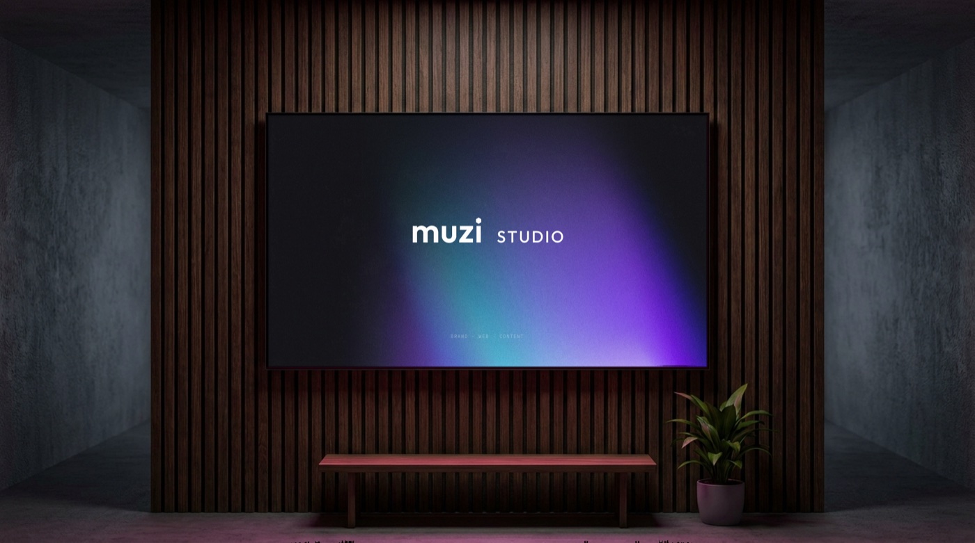
Left: the Services, Work and About pages on a phone. Right: a presentation title slide on a meeting-room screen.
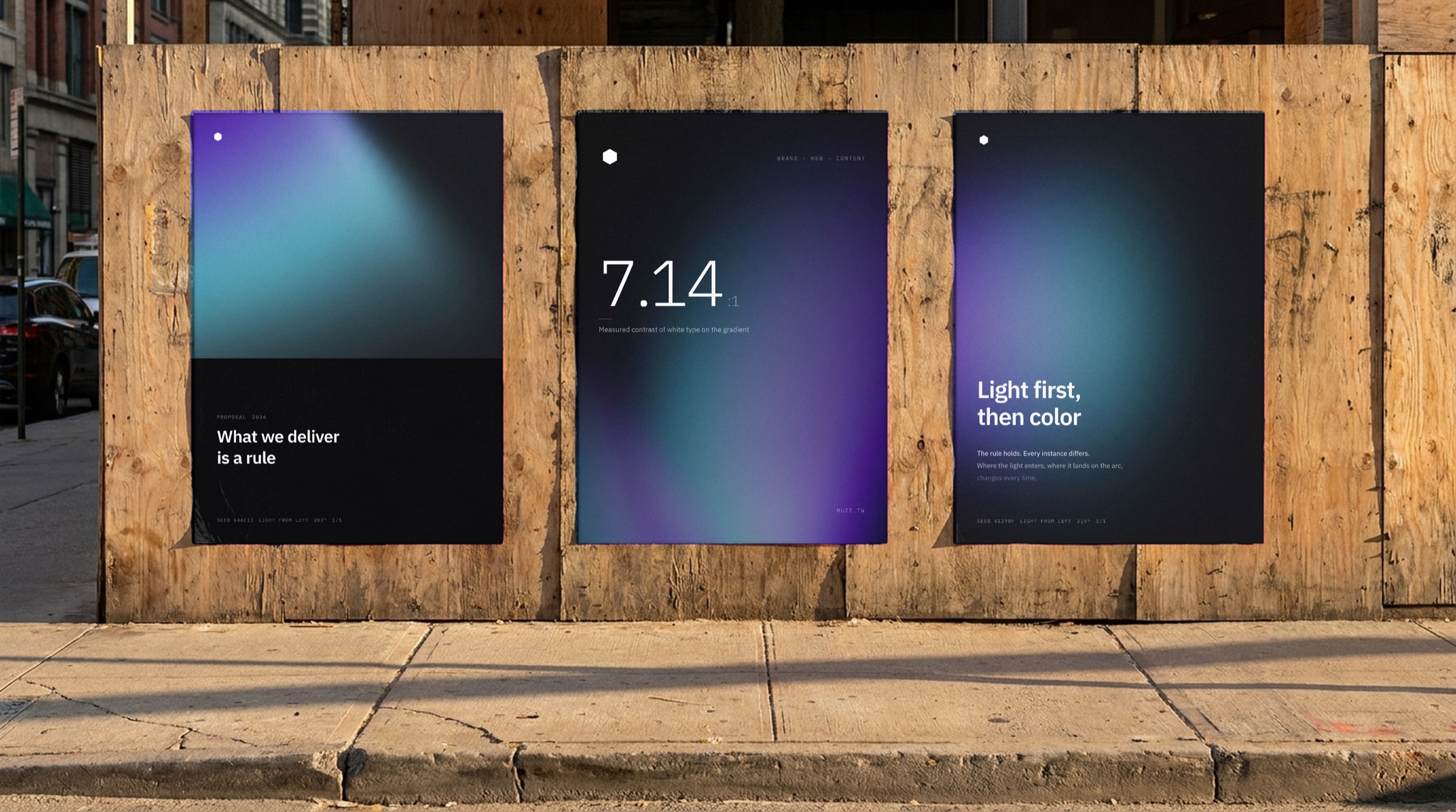
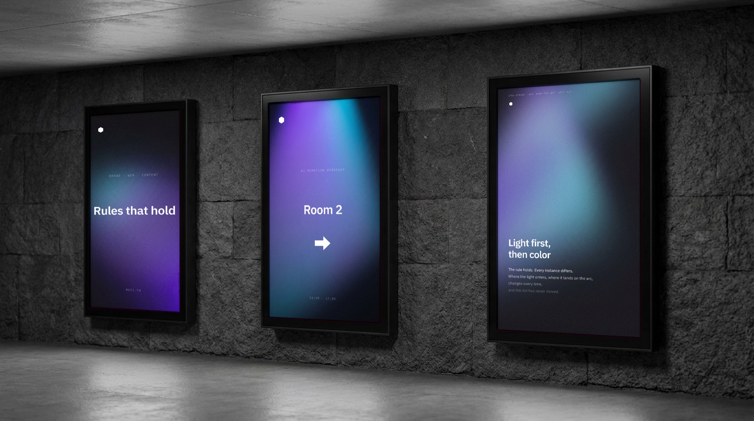
Posters and lightboxes, each claiming its own light.
What an event needs
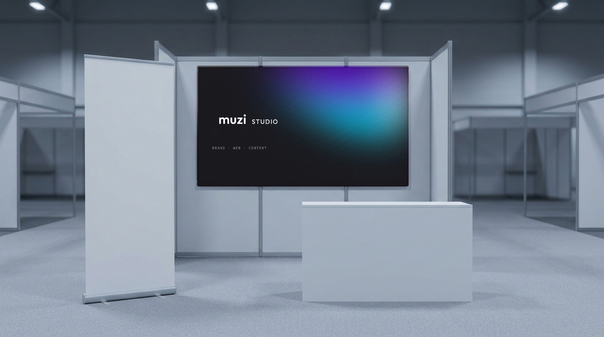
The booth backdrop and the roll-up banner each use a light that appears nowhere else. The booth is a proposal render; Muzi has no physical venue right now.
Merch
Merch always uses light fields, because it carries no information. Each piece claims a light that appears only once, and what’s printed on it is that light’s 1/1.
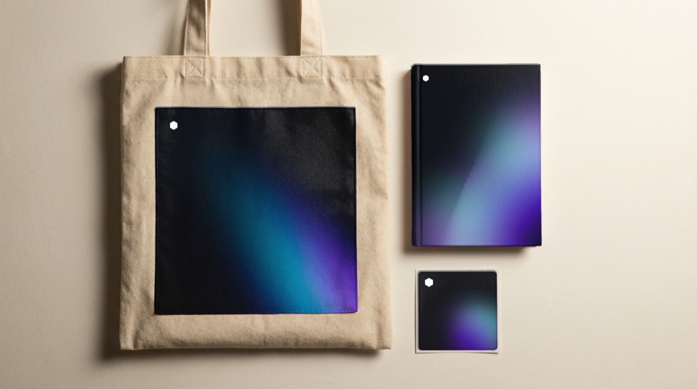
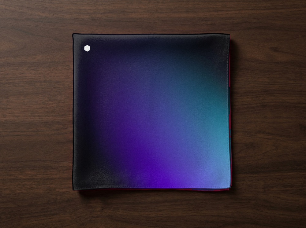
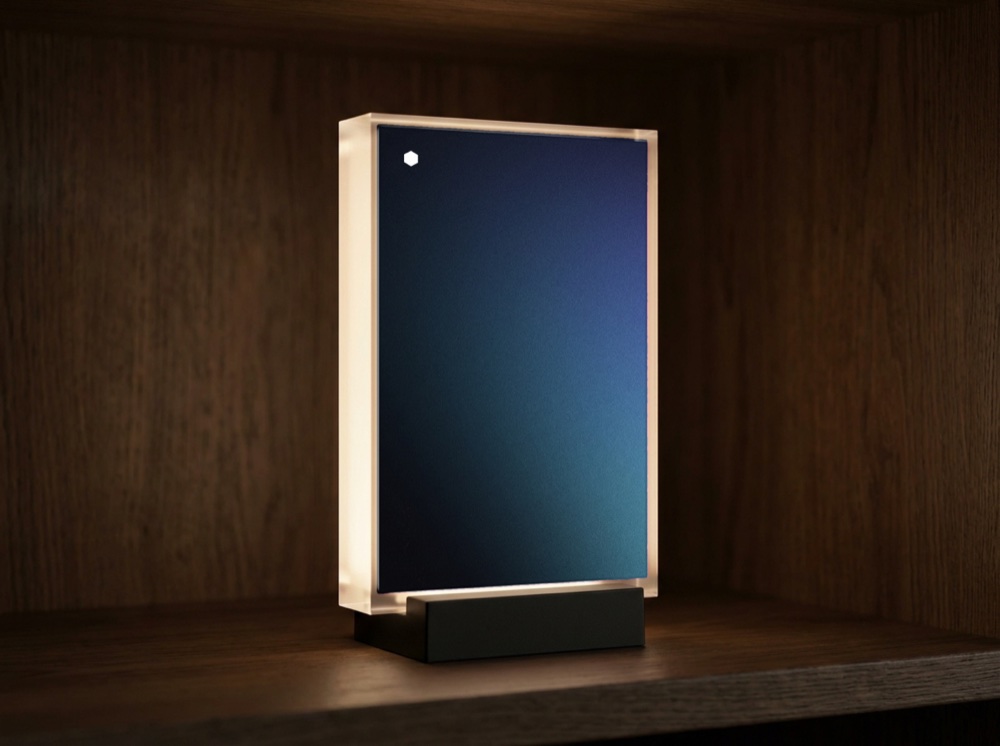
Tote bag, notebook and stickers; silk scarf; acrylic light block.
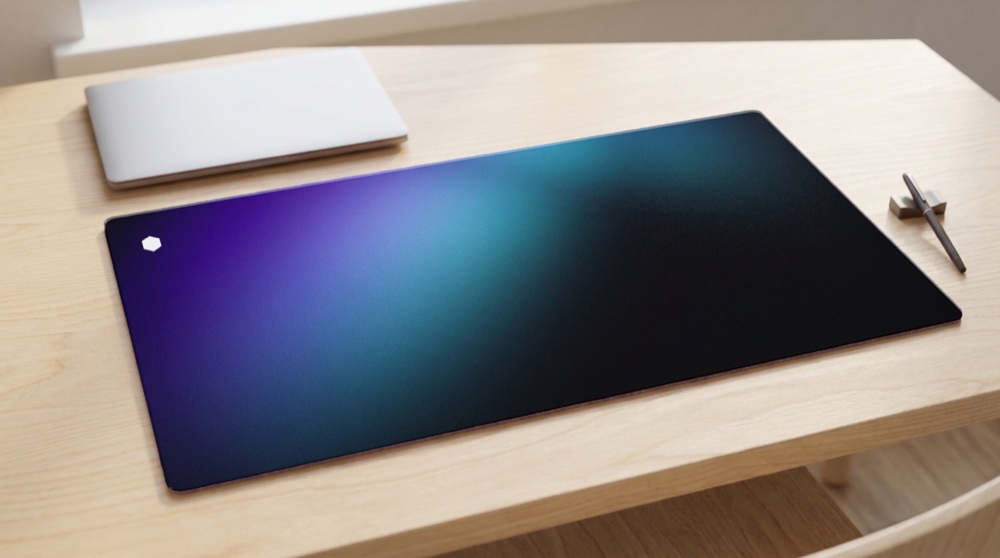
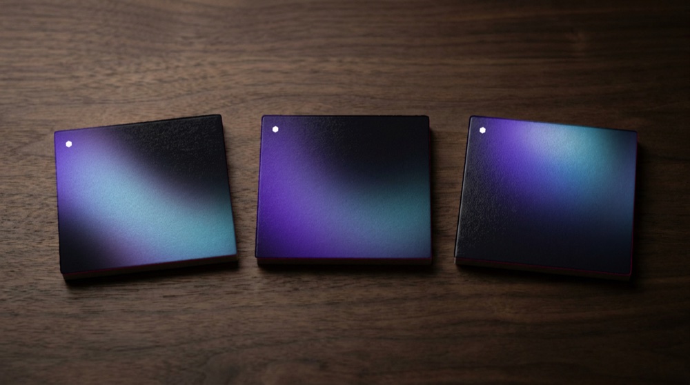
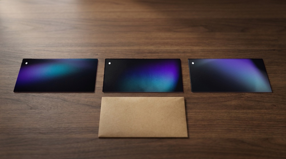
Desk mat; set of three coasters; set of three postcards.
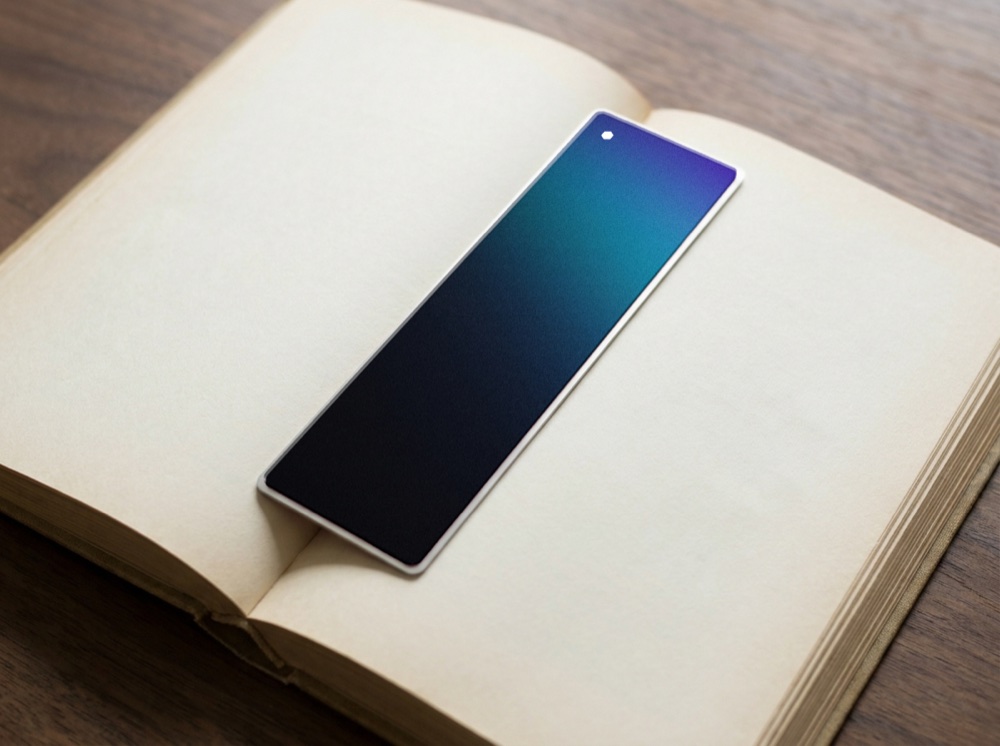
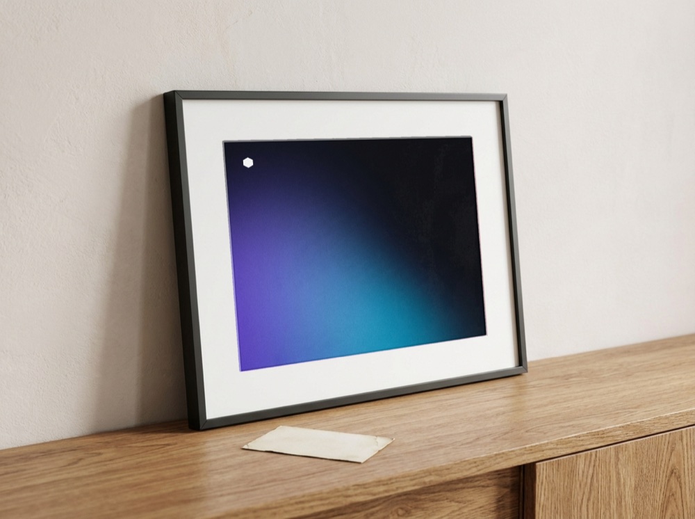
Metal bookmark; framed giclée print, an edition of one.
07
/09
MOTION
In motion
In motion, only the light moves. The mark and the type stay put.

The intro. From black, light rises from the edge and washes across the frame. The mark appears top left, then the wordmark. This is the only time the dot moves: no spinning, no looping, no blinking.


Left: the light field drifts slowly. Here it’s compressed to a seven-second loop; the rule is 18 to 30 seconds, with no visible seam. Right: between sections, the frame falls back to ink before the next light comes up.
Four transition speeds
SpeedDurationUsed forInstant0msState changes: check, focusFast120msButtons, tagsStandard240msPanels, drawersSlow400msPage transitions, the dot settlingDon’t use> 600msPeople start waiting for it
08
/09
AFTER HANDOFF
After handoff
What we delivered goes beyond guidelines: a set of rules that run on their own every day.
Three checks that block
01Identityverify_muzi_identity.py41 assets9 constantsZero font dependencyPassed02Layoutverify_muzi_case.pyEight-step type scaleOne left edgeOne set of section heads9 acts, 30 sectionsPassed03Renderverify_case_render.pyImages loadNo squashingNo overflowNo empty bandsContrast OKCaptionedPassed
The second check ran on this very page. What it caught was “the page invented a ninth type size,” an error that otherwise just looks like “this line seems a little big.”
Thirty-three blocks, one contract
Wordmark, geometry, color, light, type scale, spacing, states, layout, motion and craft all live in one JSON file. The page reads it, and so does the generator.
muzi-tokens.json33 blockstypeface / metricsType family, stem width, x-height, cap heightwordmark / mark / lockupDotless i, hexagon ratio, optical spacingcolor / gradient / neutralsThe only color event, nine stops, seven neutral stepslight / web_gradeColors sampled from the light, the muted web gradebilingual / parentChinese and Japanese on the second line, parent gradient barmotionFour speeds, only the light movestype / space / layoutEight type sizes, nine spacing steps, text columnextensionSeven constants, one variable, four prohibitionscraftSix visible craft details
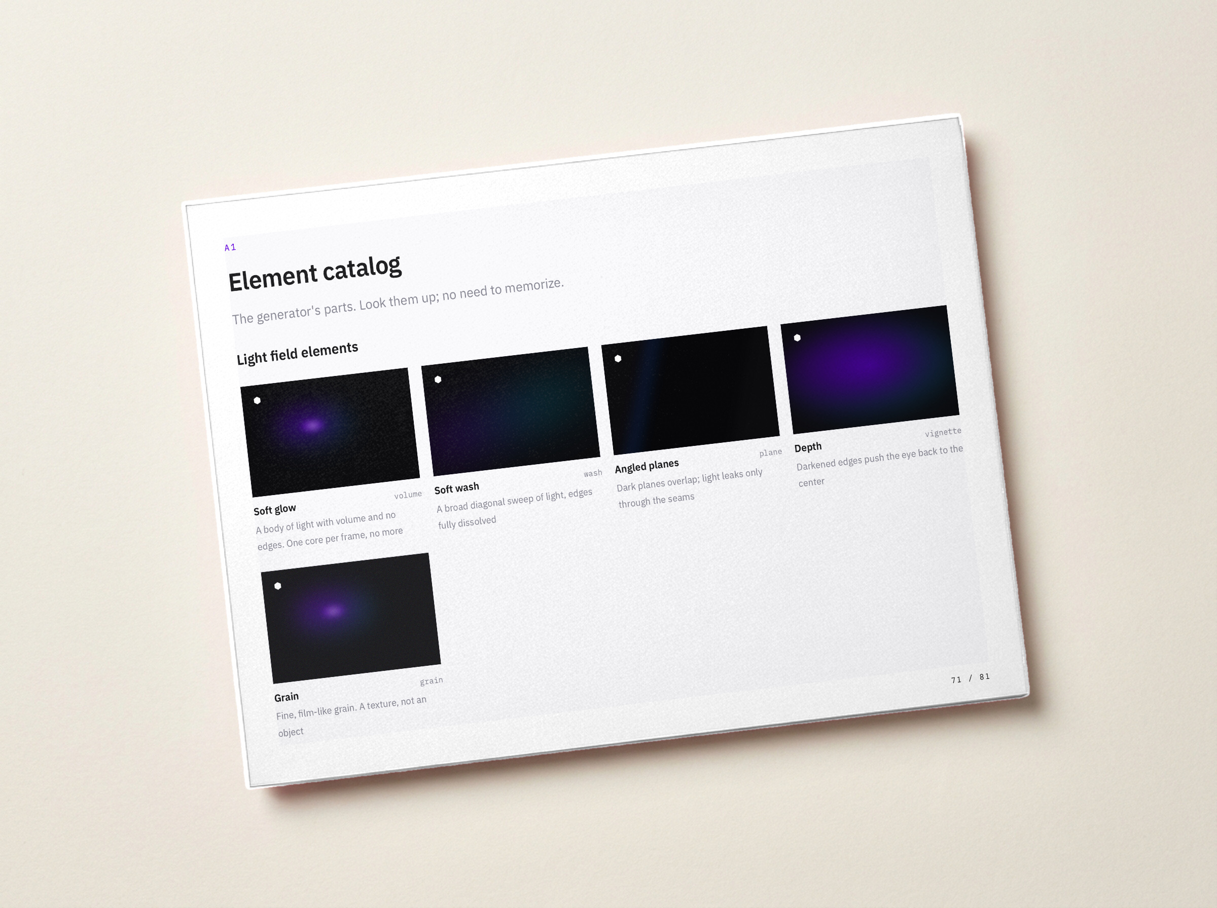
Left: the 81-page brand guidelines, with HTML and PDF built from one source. Right: an excerpt from the tokens.
"mark": {
  "shape": "hexagon", "orientation": "pointy-top",
  "corner_radius_ratio": 0.0,
  "tittle": { "flat_width_over_stem": 1.2,
              "gap_above_x_height_over_stem": 0.5 }
},
"gradient": { "from": "#6400DE", "to": "#00A1C5", "stops": 9 }
09
/09
THE OUTCOME
Deliverables and results
What we delivered
Wordmark and mark41 assets: horizontal, small size, reversed, monochrome, Chinese and Japanese bilingual, the muzi parent markDesign tokens33 blocks in a single JSON file. The pages read it, and so does the generator.Extension rules and generatorSeven constants, one variable, four prohibitions. Give it any suffix, and it derives a valid combination.Nine-stop gradient and surface paletteOne seven-step neutral scale; every other color is sampled from the light. The safe zone for white text calculates out to 61%.Icon construction rulesStroke width, terminals, corners and grid are all defined as rules. The current 11 icons are the first batch, and however many come next grow from the same rules.The whole muzi.tw siteEvery page draws on the same tokens, and the wordmark and icons are computed.
ResultsThe rules are running now. Every page on muzi.tw draws on the same tokens, and the wordmark, palette and icons are computed by the generator, not files sitting in a folder.Still in progressVenture and Institute are still just names. The rules can take them, but what those two lines will charge for, and whom they’ll serve, is still open.
For a brand design studio, working out how to build its own brand turned out to be the hard part.
Credits
Design & BuildMuzi StudioClientInternal projectYears2016–2026SolutionsBrand Identity: strategy, identity, design systemDeliverablesWordmark and mark, design tokens, extension rules and generator, gradient and palette, service icons