

Solutions · Brand Identity
LifeOS brand identity
If the contrast fails, it won’t let us commit.If a color fails, the commit is refused.
The client wanted a mark that would last a lifetime. We started from Japanese seal culture. A vermilion seal pressed onto paper says someone has looked at this, checked it, and stands behind it.
This project ran on our Brand Identity track. What would the same approach look like on your project?
TypeDesign system · Brand IdentityYear2026RoleStrategy · Identity · Design system · Engineering guardrailsScope13 domains · 46-chapter brand guidelines · 1,102 icons · 8 validatorsStatusActive

The mark, pressed into cotton paper. The whole system ended up as a seal: stamping it means it has been checked.
01
/06
THE SITUATION
Where things stood
LifeOS is a personal operating system that runs 13 domains of life: money, health, parenting, Japanese, the house. It doesn’t get redesigned every few years. It grows old with the person using it. The client’s brief was one line: this mark has to last 30 years.
We went and looked at seals. In Japan you run into many of them every day: the square seal at the ward office counter, the goshuin at a shrine, the personal seal on a delivery slip. They all look different, but they do the same job: they leave a mark on a document that says “this has been checked.” And a single seal gets pressed thousands of times, identical every time.
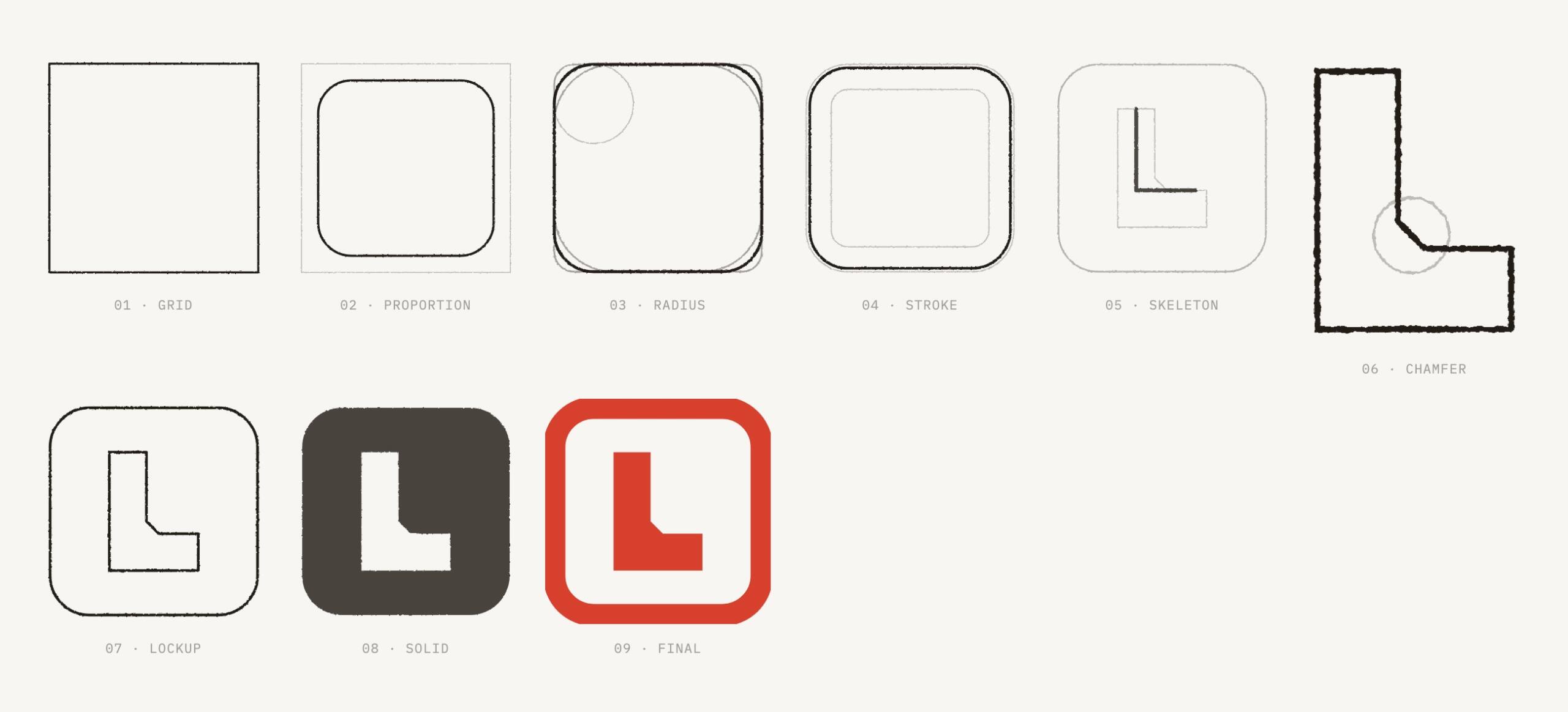
That is exactly the shape of LifeOS. So the outer frame of the mark comes from the rounded square of a seal, with an L inside.
The vermilion wasn’t picked by eye. The vermilion in the ink pot and the vermilion on the paper are not the same color. The traditional Japanese color called shu leans orange. The hue a seal actually leaves is registered in the JIS standard for seal ink as Munsell 7.5R 5/14, a difference of ΔE 22.4. For print, the spot color is PANTONE 7417 C rather than the deeper 173 C, for an equally practical reason: uncoated stock darkens it by another step. Choose color with the paper in the equation, not just the numbers on a screen.
ConstraintsThe mark had to stay recognizable at 16 px, because it would sit in browser tabs.The system runs every day. Existing screens couldn’t pause while we redesigned.The client had no designers. Any rule that needed a meeting to enforce didn’t count.More domains were coming. When the 14th arrived, the rules had to hold on their own.
02
/06
THE CALL
The decision
A seal’s meaning isn’t in its shape. It’s in the moment it comes down: someone has checked.
Why we did it this way
The line at the bottom right of each card is what it cost.
01Write the guidelines into code that blocksColor palette, icon sources, font declarations, contrast: all of it became automated checks. Anything that breaks them can’t get into version control. However well a document is written, it’s still people who carry it out, and people get tired.Cost: every rule has to be written in a form a program can judge. If it can’t be, it doesn’t get to be a rule.02Let a checker judge icon qualityWe used to check icons by eye. Then one day we realized the eye simply can’t see a 0.25 difference in stroke width. Once we switched to file-by-file comparison, a whole batch in the library failed on the spot. We had drawn that batch ourselves.Cost: the day the checker went live, the first thing it blocked was us.03New background, recalculate every colorThe neutral scale had been tuned for a dark interface. Moved onto light paper, all six colors failed as text. The worst came in at 2.17 against a threshold of 4.5. In print it looked perfectly fine. Only the math showed it.Cost: one palette became two sets of calculated values, and every document has to state which background it’s for.04One alignment problem, three rounds to fixThe mark sits inline in headings and has to line up with Chinese characters. Round one used baseline alignment. Round two recalculated the frame from the ratio in the guidelines. Both were rejected. In round three we measured the asset itself and found the ratio in the guidelines had been wrong all along, and that a frame rebuilt in CSS would only ever be an approximation. Close is worse than clearly different. Off by just 1.25px, the eye doesn’t read it as a mark. It reads it as misaligned.Cost: we spent two rounds tuning parameters before changing the approach in the third. Since then the mark is always embedded as the asset itself. CSS approximations aren’t allowed.
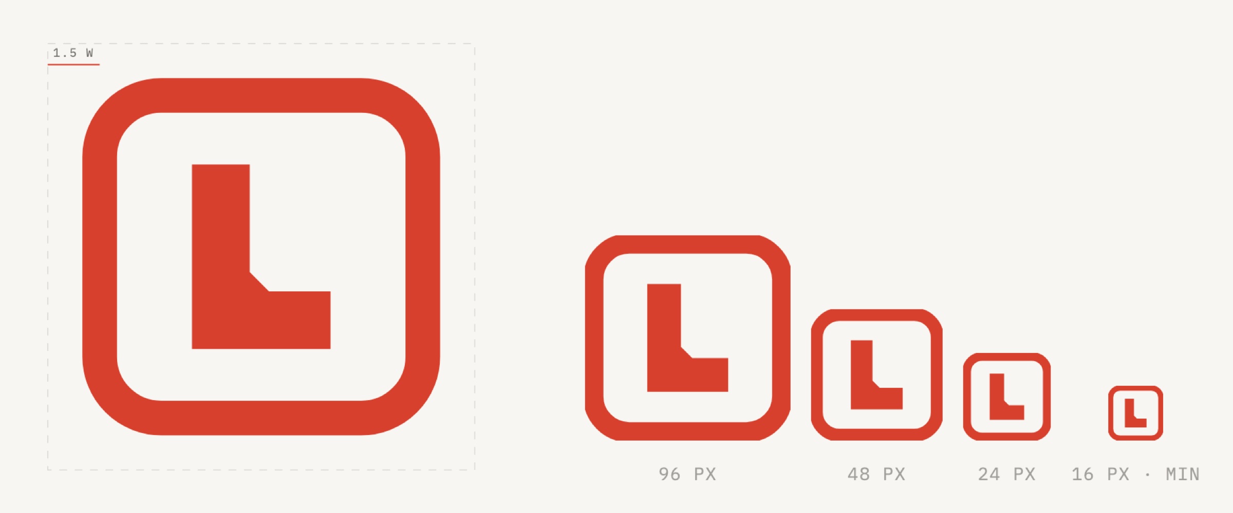
Clear space is measured in stroke widths. Fixed values break when the size changes. Ratios don’t.
The shape was derived, not drawn
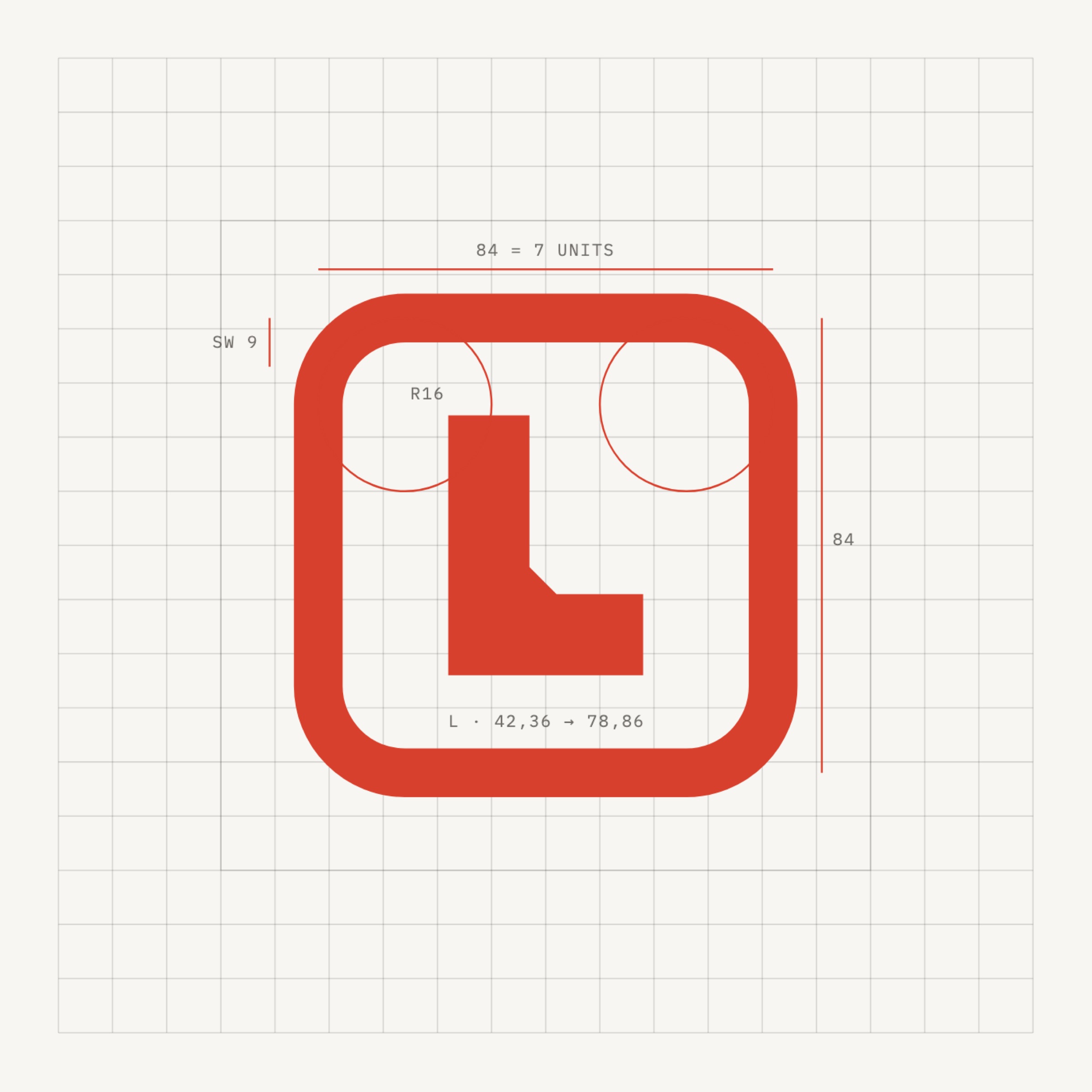
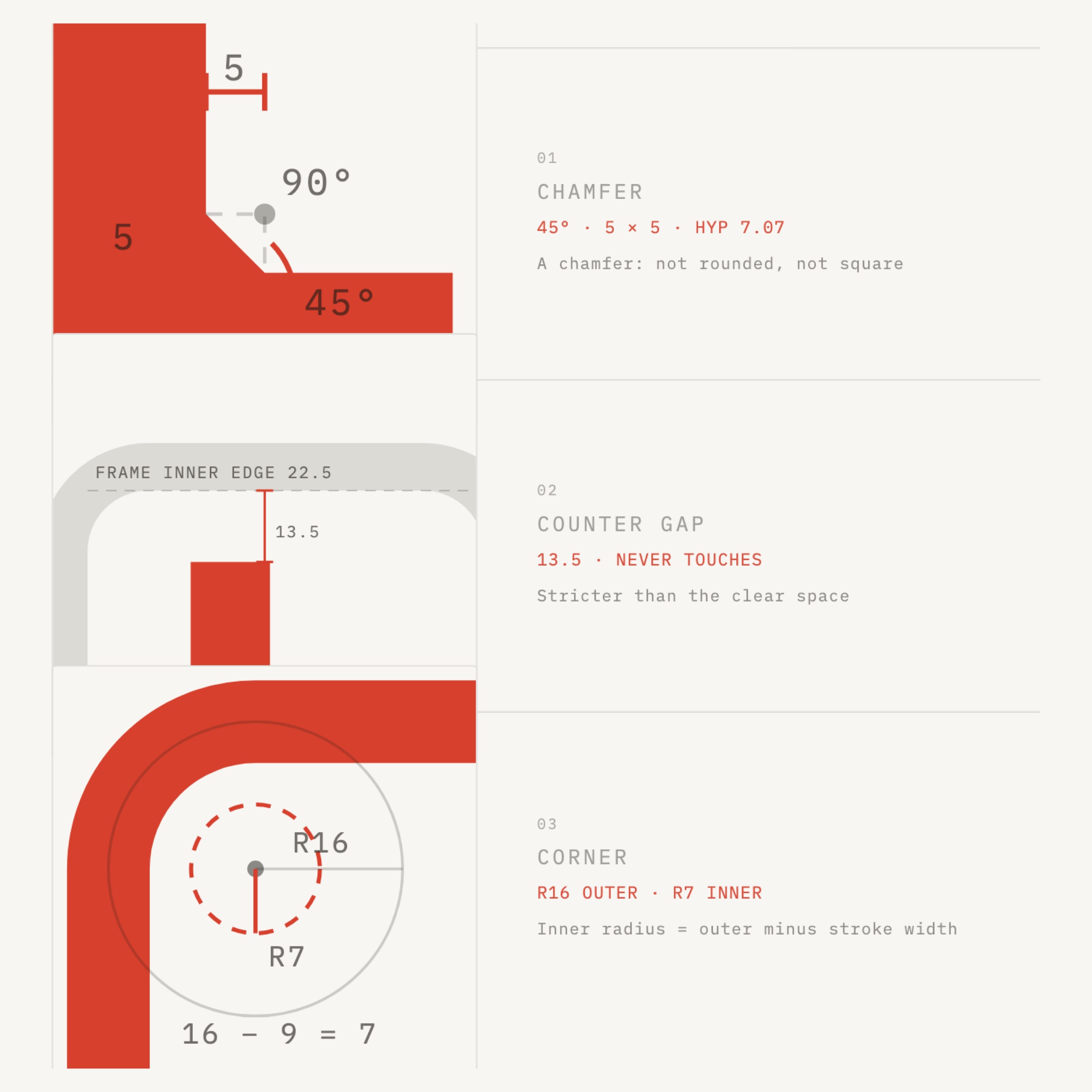
Left: the form is derived from a 12-unit grid. Right: three decisions that belong only to this mark: a 45° chamfer, a constant gap of 6 between inner shape and frame, and corner radii of R16 outside and R7 inside.
03
/06
THE ARTEFACTS
What the system looks like
The work first. Everything below is what a rule produced.
Six seal states. The color is the verdict.
The seal only goes on verified facts. So it needs a way to say “no verdict yet” and “rejected,” and neither can share the vermilion used for “passed.”
StateColorMeaningReversibilityDeliveredVermilionRan end to end and was delivered—PassedVermilionCleared every gate—PromotedVermilionMoved up one stage on the ledger—UndeliveredCrimsonRan to the end but wasn’t deliveredRetryableRejectedCrimsonRetired on record; the number is never reusedFinalPendingMistNo verdict yet—
Two states share crimson, and reversibility separates them: undelivered can be retried, rejected is final. Pending is the only state that doesn’t announce an outcome, so it uses mist instead of vermilion. From a meter away, without reading a word, you can tell whether something has a verdict.
We handed over rules, not image files
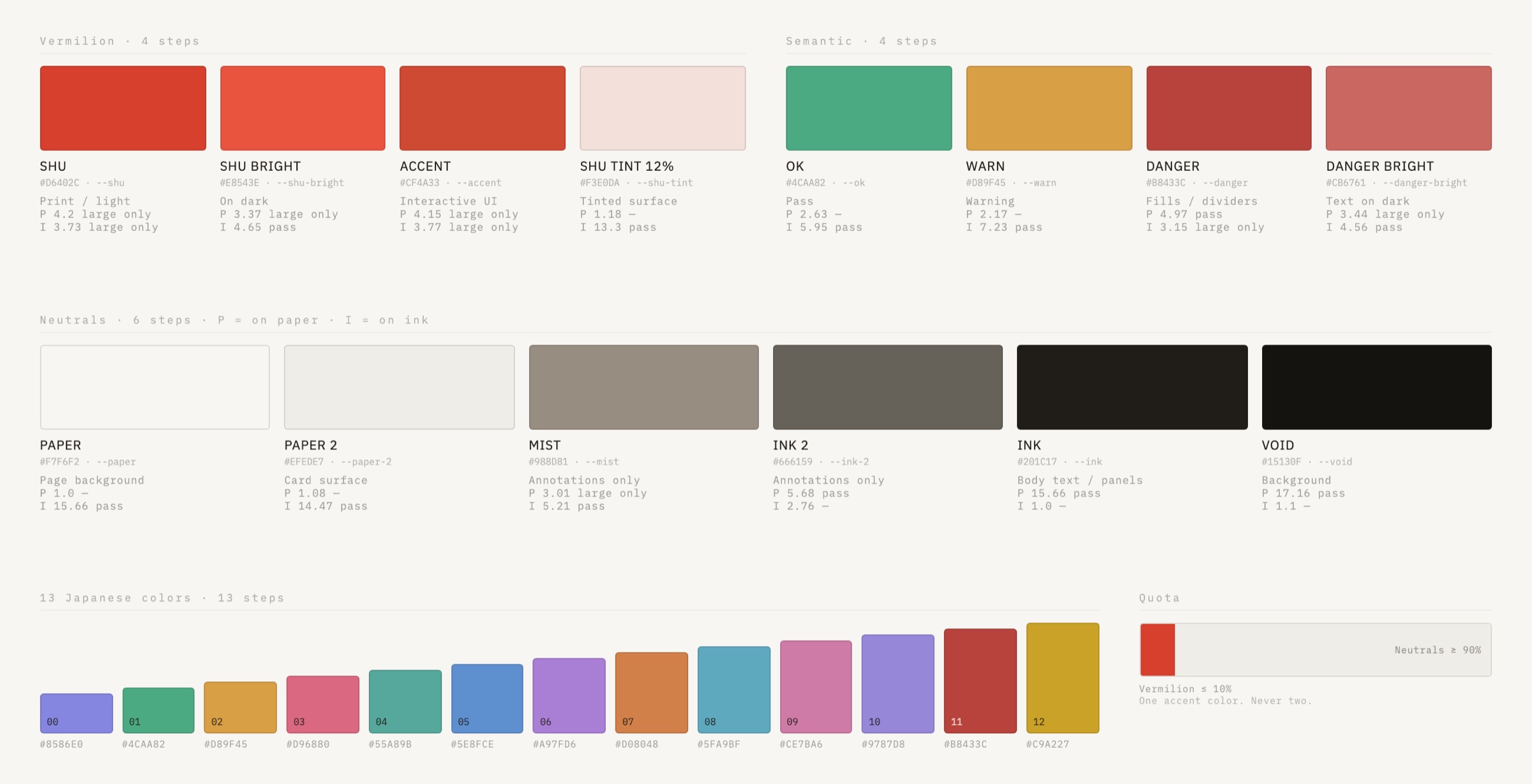
Four families, 27 swatches: four vermilions (logo, dark background, interactive, surface), six neutrals, four semantic colors and 13 traditional Japanese colors. Every swatch comes with calculated contrast against paper and ink, and the last column is a quota: vermilion may never cover more than 10% of a screen.
SwatchContrast on paper · WCAG 4.5RatioPAPER1.00WARN2.17OK2.63MIST3.01SHU4.20DANGER4.97INK15.66VOID17.16
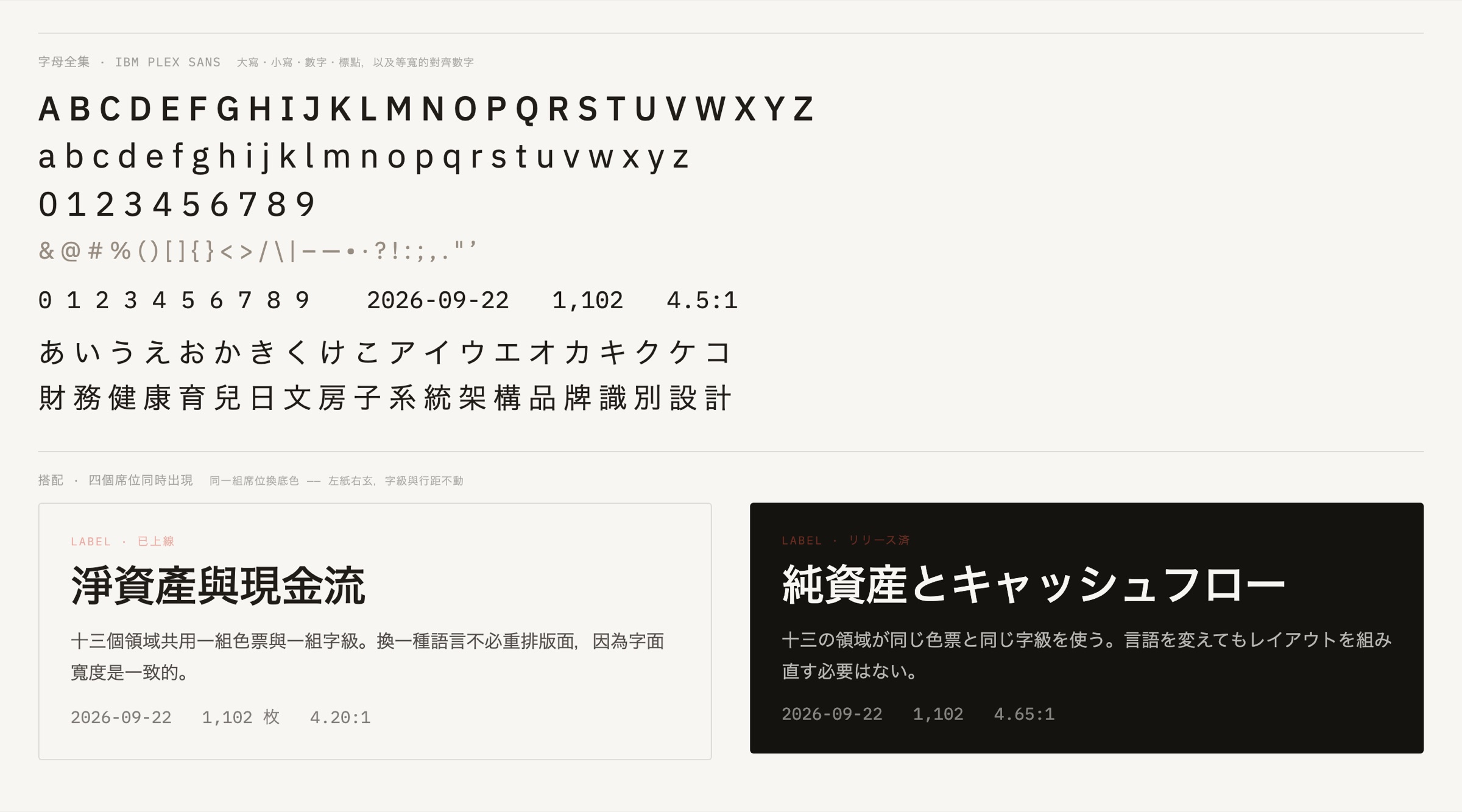
Top: the full character set. Bottom: the same slots on a different background, with size and line height unchanged.
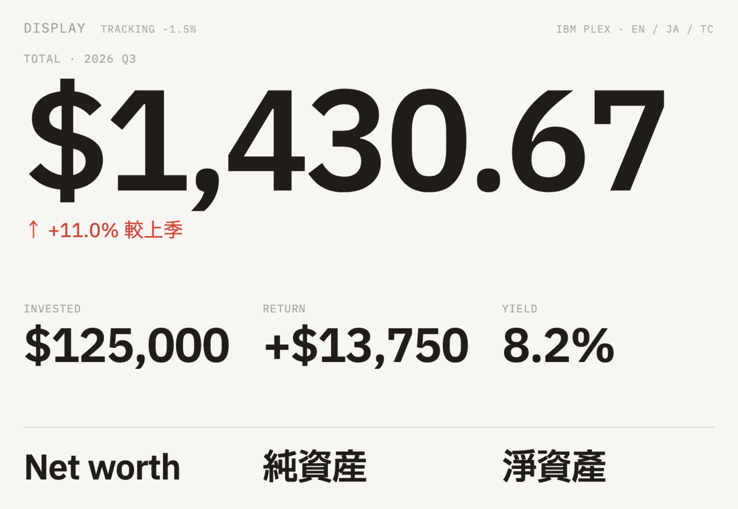
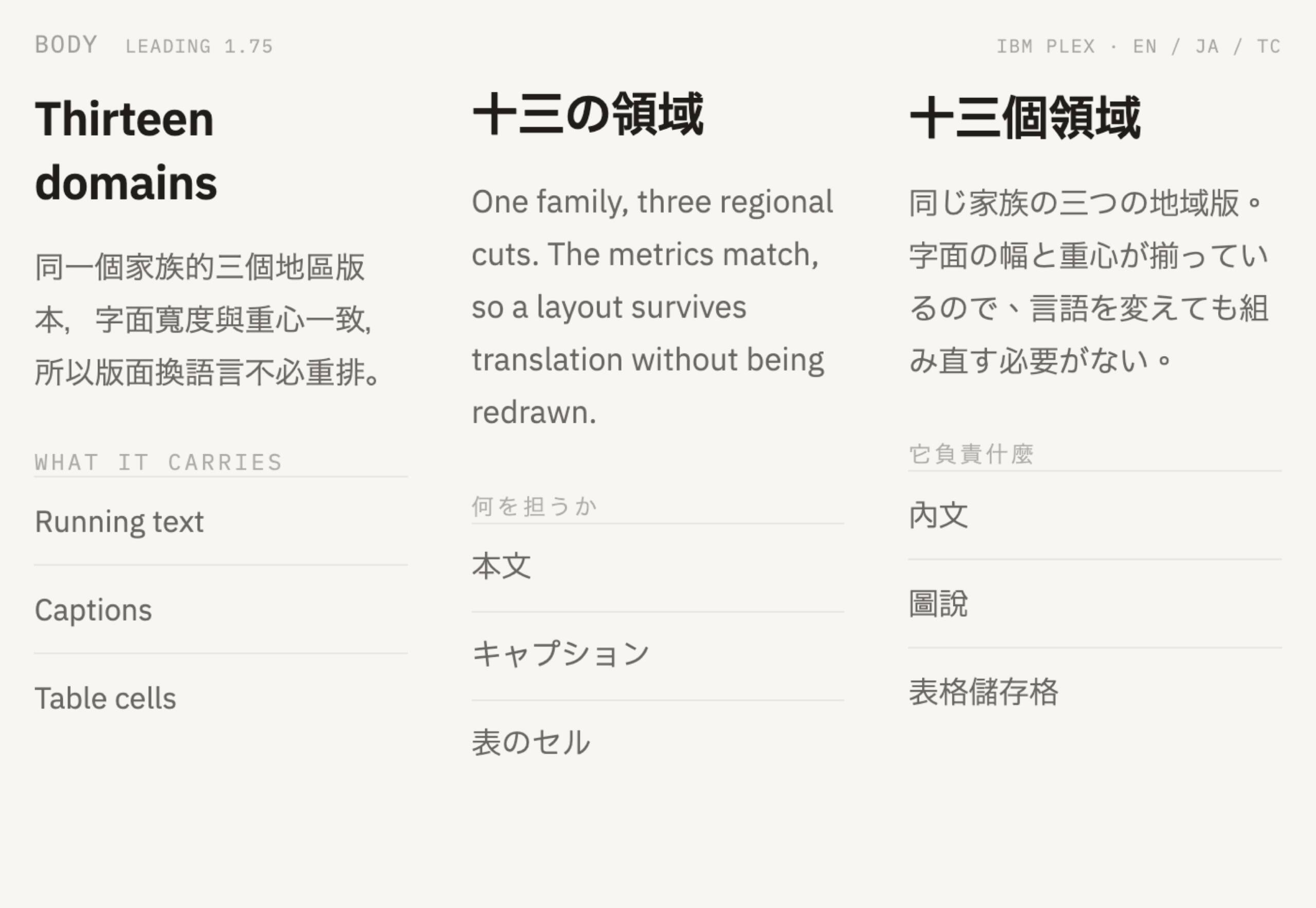
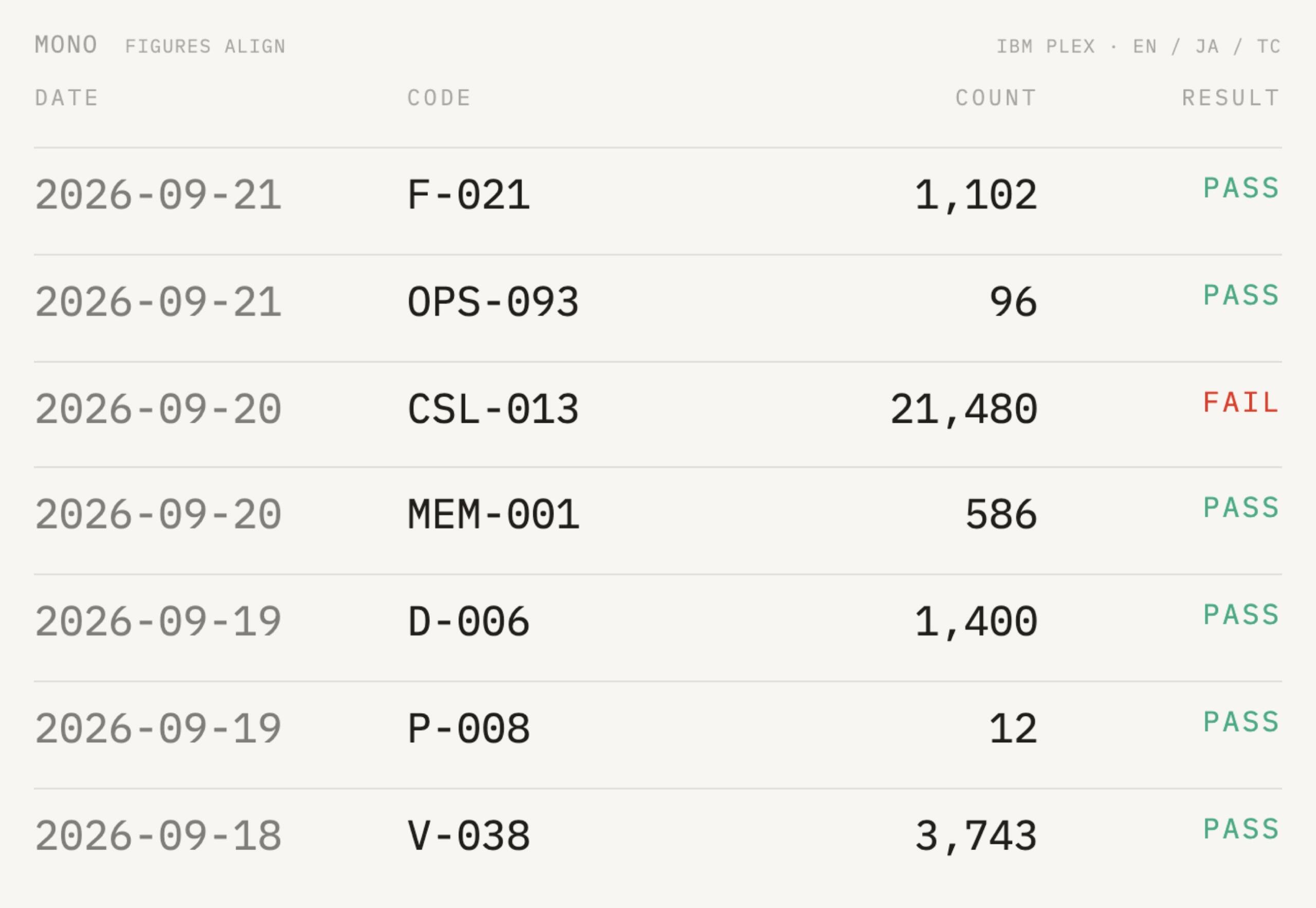
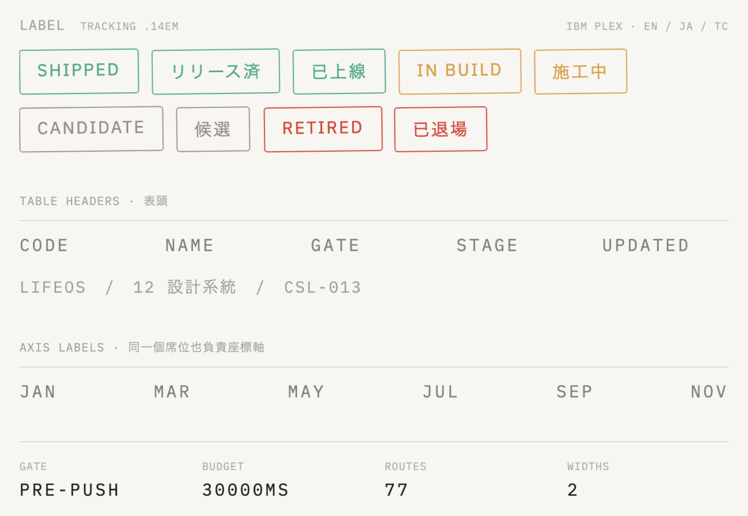
Four slots, one image each, shown as they actually appear in the product. The three regional versions of the family share the same glyph widths, so switching languages never forces a relayout.
1,102 icons, one set of craft parameters
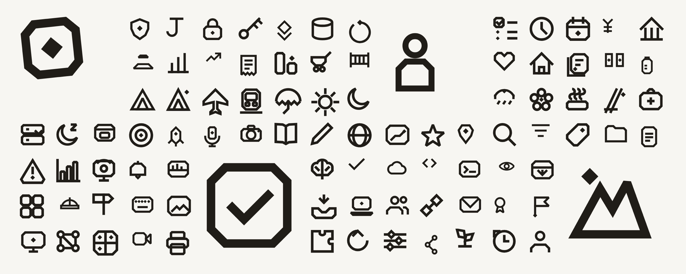
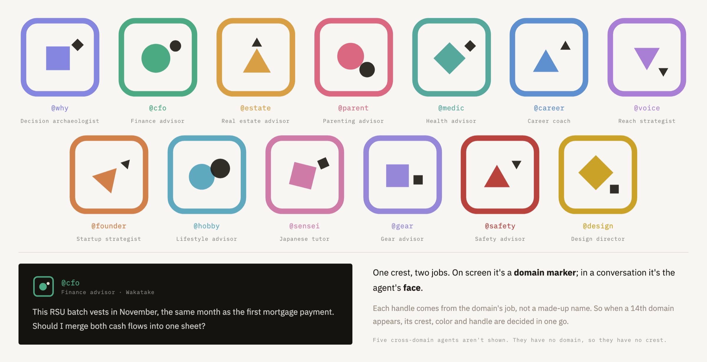
Each of the 13 domains has a resident agent, and the crest is its face. The handle comes from that domain’s job title, so when a 14th domain appears, its crest, color and handle are decided in one go.
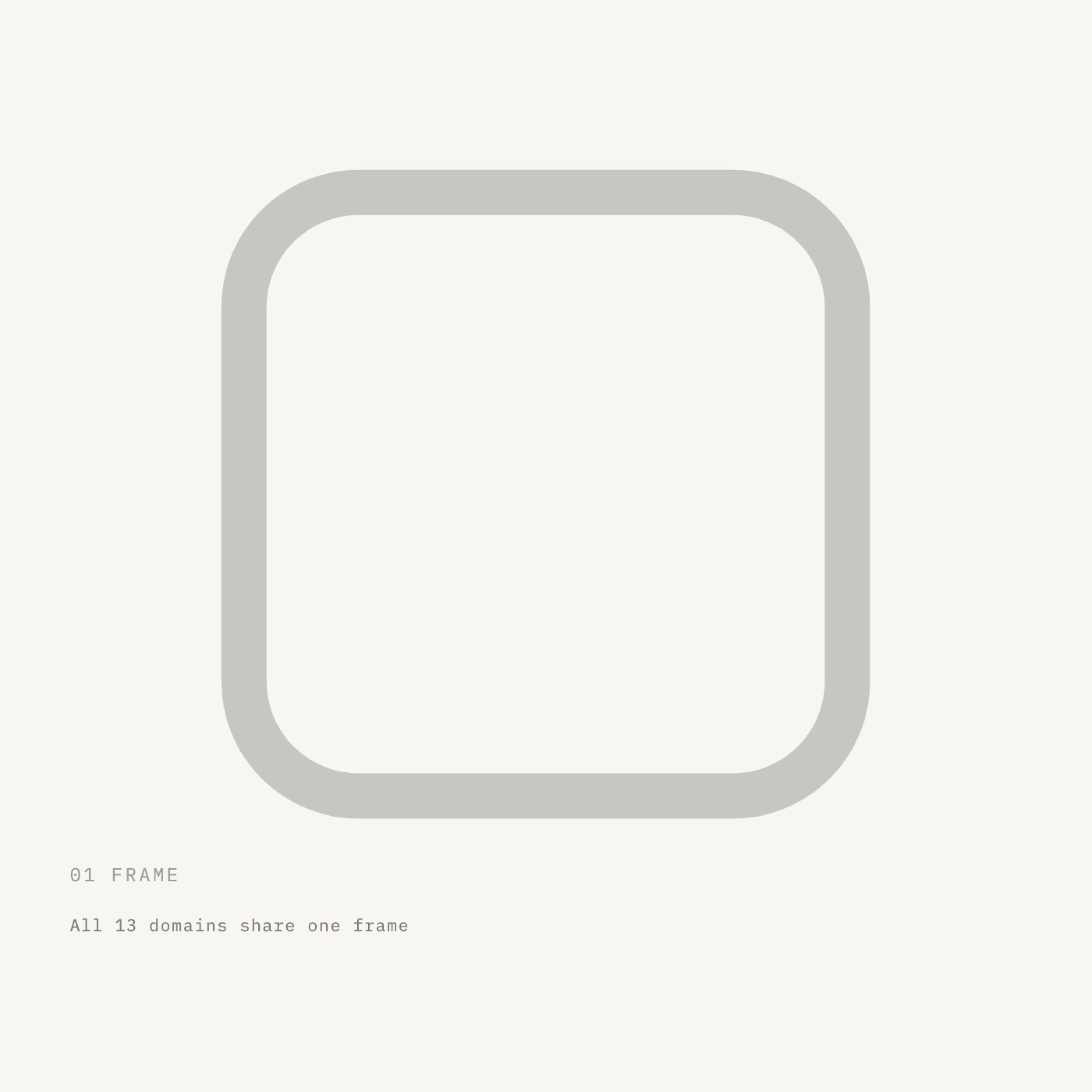
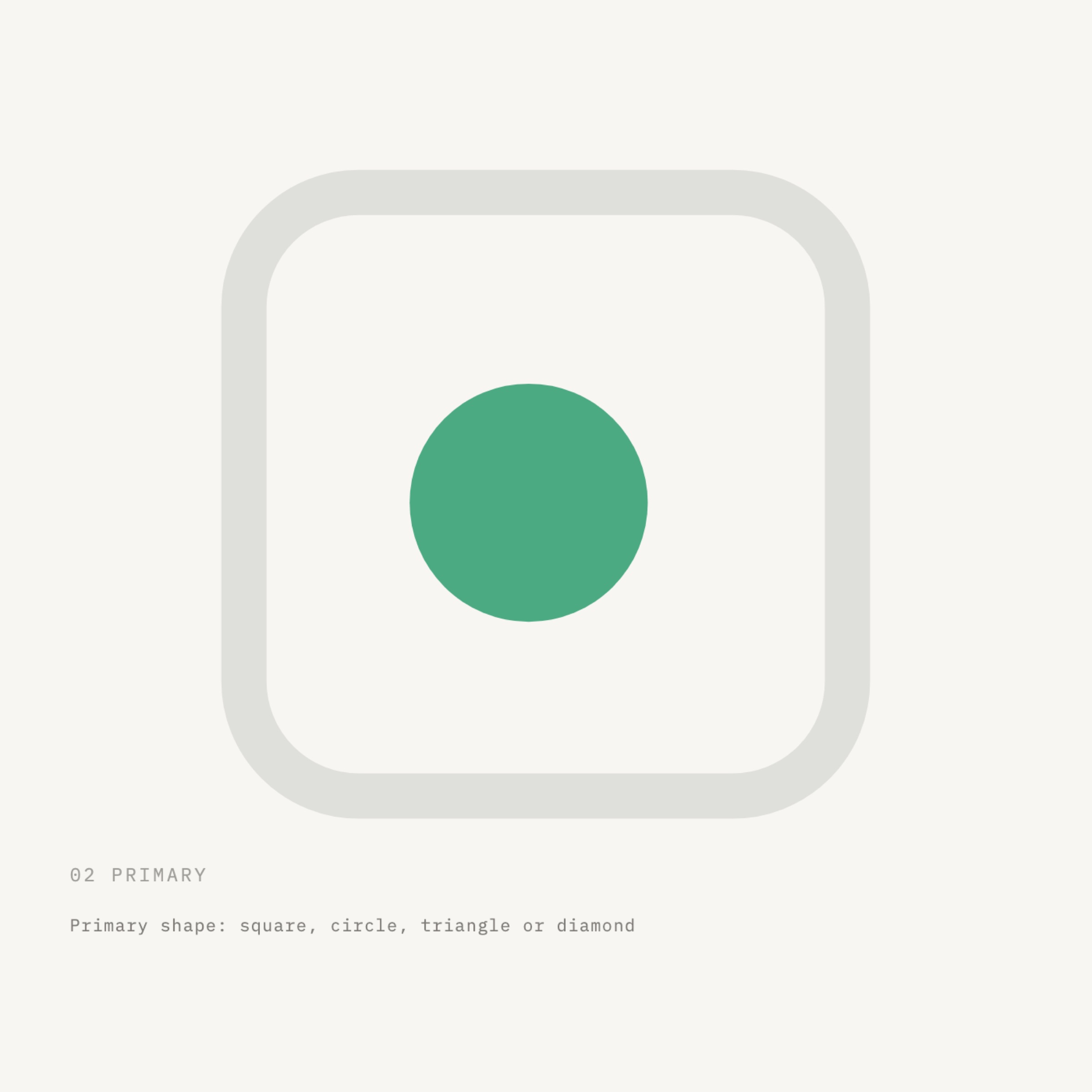
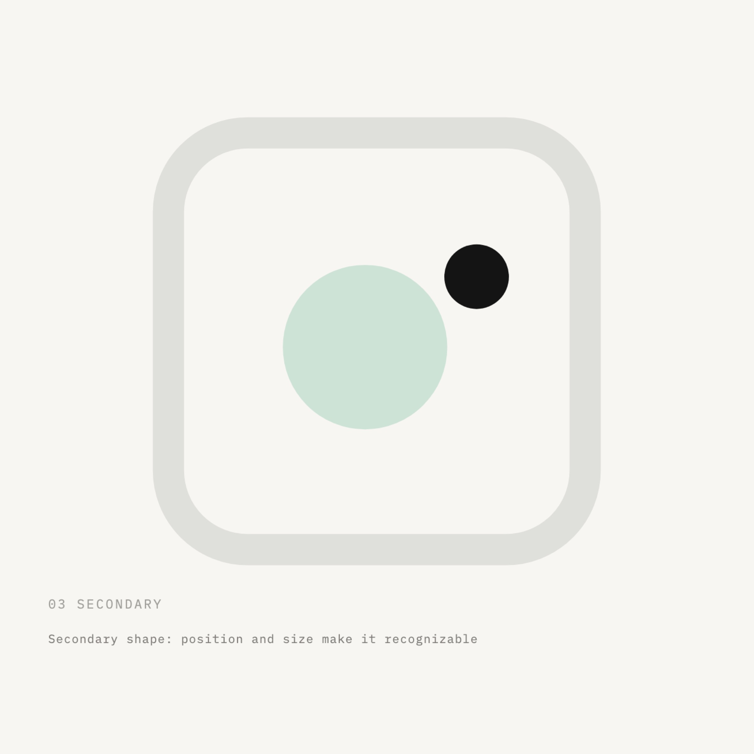
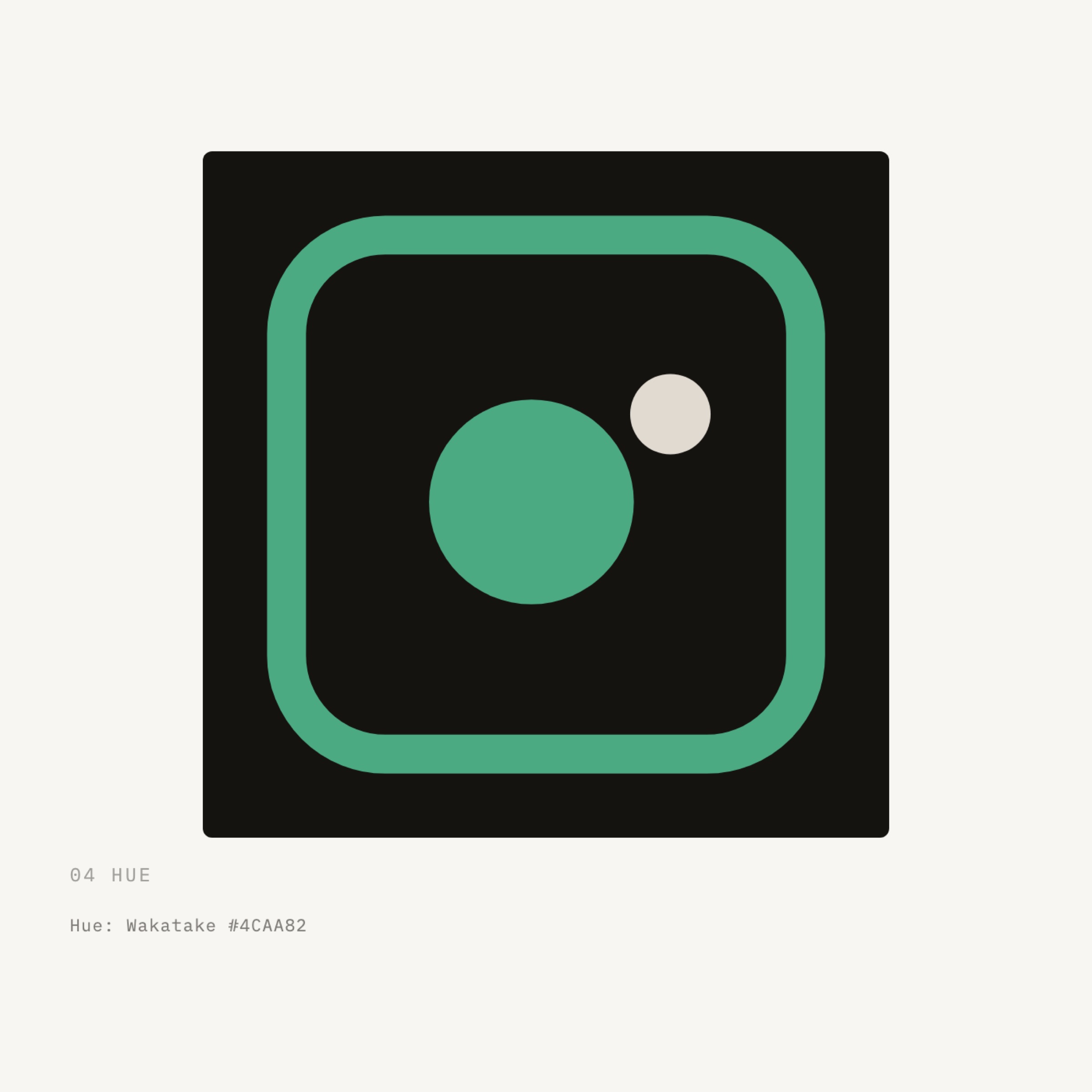
One frame, one primary shape, one secondary shape, one hue. When a 14th domain appears, nobody has to start from scratch.
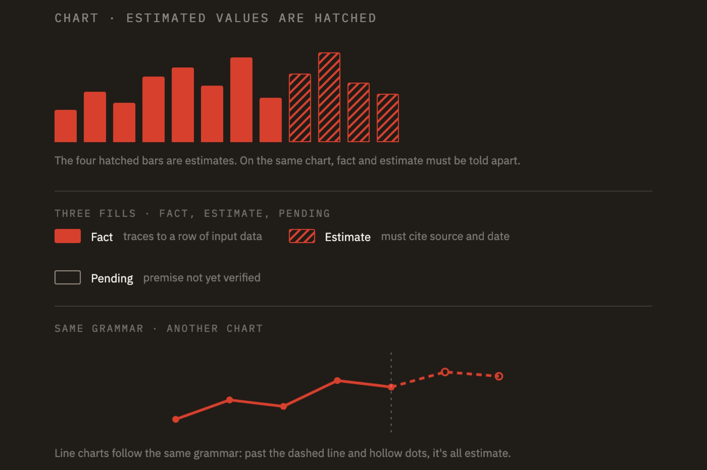
Facts and estimates never share a fill
What this system produces is decisions, and decisions travel as charts. So charts get the same standing as the logo: they have a grammar too.
How it’s drawnWhat belongs hereFactInk · solid fill, solid line, solid dotTraces back to a specific row of input dataEstimateMist · 45° hatching · never solidCalculated from existing data; always cites its source and calculation datePendingMist · outline only · stamped with a gray “pending” sealRests on a premise not yet verified
The real job of this rule is to make it impossible to draw an estimate so it looks like a fact. A report that mixes the two with no way to tell them apart is worse than no report.
Ask the question first, then pick the chart
Chart types come from questions. There’s no menu to choose from. Each of the nine families answers one kind of question.
A CompositionHow is this broken down?100% stacked bar for up to five categories; treemap for hierarchiesB ComparisonWhich is bigger?Horizontal bar ranking for long names; dumbbell or slope chart for two points in timeC DistributionWhat does the distribution look like?Histogram for large samples; beeswarm for under 60 itemsD Time seriesHow does it change over time?Line or area for a single series; stacked area for composition changesE FlowHow does the money flow?Waterfall for additions and subtractions; Sankey for many-to-manyF RelationshipAre they related?Scatter plot for two metrics; bubble chart for three; correlation matrix for many-to-manyG RiskHow bad can it get?Underwater drawdown for historical data; Monte Carlo fan chart for simulationsH ProgressHow far from the target?Bullet chart when there’s a target; domain scale for comparing across domainsI AuditAre these numbers reliable?Seal ledger for single events; status matrix across multiple automations
So picking a chart doesn’t take a meeting: the question sets the family, and the family sets the form.
04
/06
THE WORK
How we did it
We took this on the way we take on any commission: find a starting point that holds up culturally, then derive it into rules you can measure.
How we approached it
01Start from a real object, not an adjectiveWhen a client says “trustworthy” or “durable,” that isn’t design yet. We look for something in the real world that already does that job (a seal) and derive the form from its physical properties.02Derive the form, don’t pick itWe tried corner radii of 8, 16 and 24, and strokes of 6, 9 and 12, and checked every combination at 16 px to see if it still read. The set we kept is the only one that passed.03Write rules the client can run on their ownThe client has no designers. So what we hand over can’t be a book someone has to remember. It has to be a set of checks that run by themselves. That’s where the next section comes from.
Step by step
PhaseWhat we didOutputSuccess criteria01 Field studyWent through every seal we could get our hands on: every shape different, every one doing exactly the same jobSource of inspiration and direction for the formThe starting point holds up02 DefinitionNarrowed it down to a set of tokens and decided what role each one playsDesign tokens (CSS variables and JSON)There’s a single source of truth03 GuardrailsWrote the rules as checkers that block, and wired them into version controlEight automated validatorsViolations can’t get in04 MigrationMoved existing screens over batch by batch, using the red lights as the to‑do listMigration log and exception ledgerOld debt is visible05 The bookWrote the reasoning into the brand guidelines, citing variables instead of valuesBrand guidelinesWhoever comes next understands why
Decision panel: the system drafts, a person decides

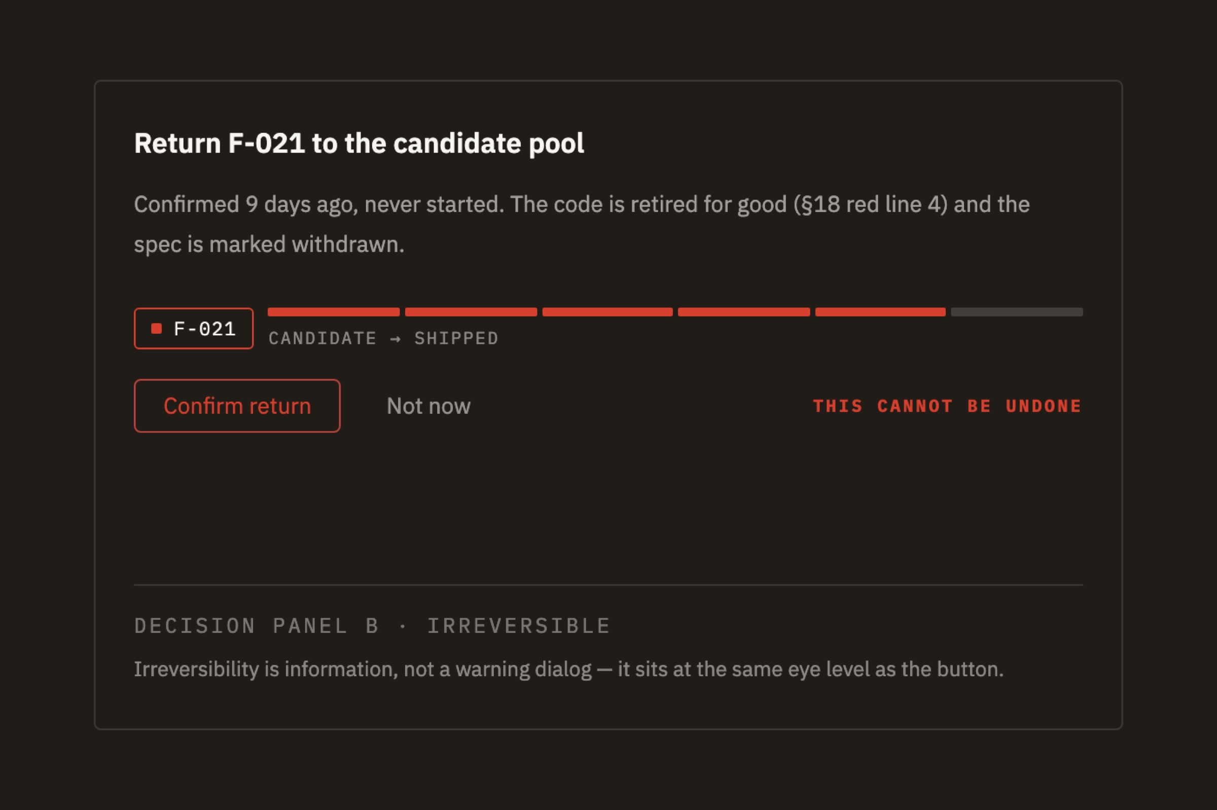
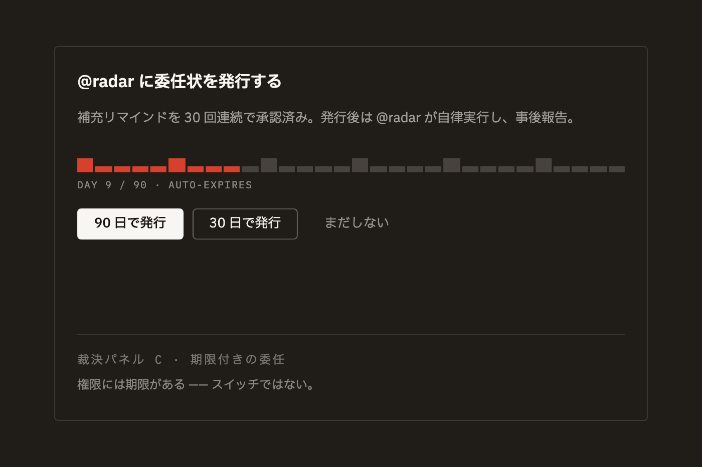
Each panel is in a different language. The third way out, “edit it myself,” is always there: the system can draft, but it never decides for you.
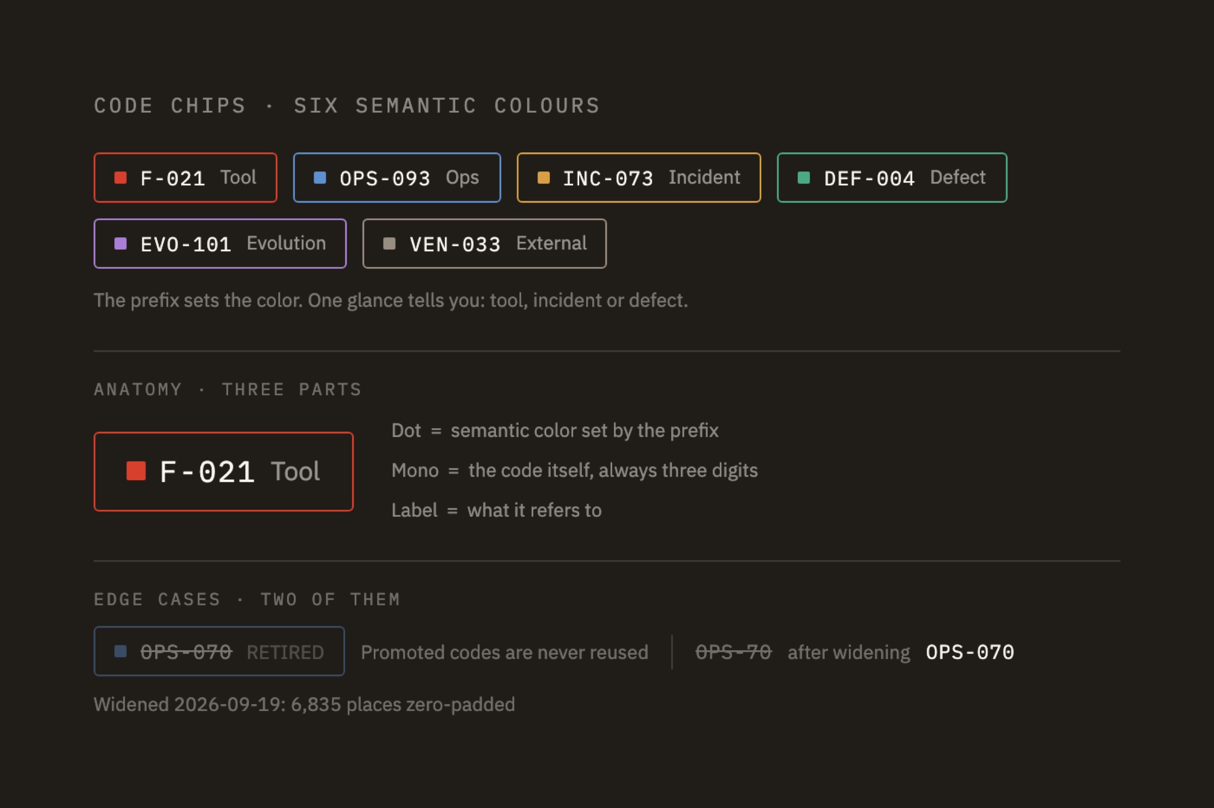
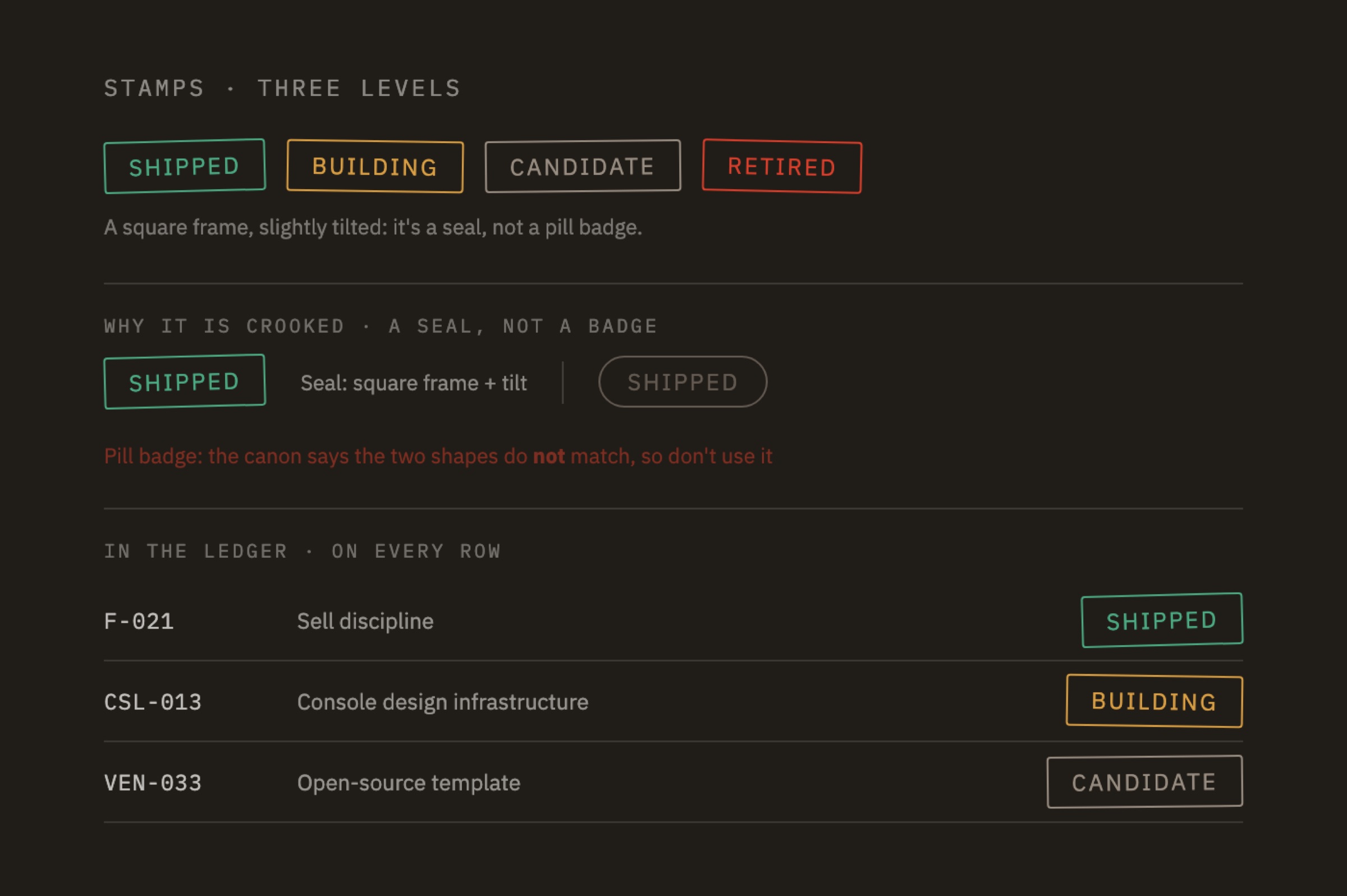
Three pieces of display vocabulary, all built from components registered in the brand guidelines, not a generic UI kit.
05
/06
THE SYSTEM
The final deliverable wasn’t a guidelines book
We still wrote the brand guidelines, but they aren’t the core of the deliverable. They’re the manual for the mechanism. What we really handed over is a set of checks that run themselves every day.
Humans set the rules, machines run them every day
Every design decision was made by people. Color, type sizes, corner radii, whether a rule should exist at all: none of it was left to a model. AI came in further down the line, turning rules that had already been signed off into a program that blocks at the moment of commit.
People01Set the rulesVermilion means one thing only: “look here” · Contrast never below 4.5 · Icon shapes always come from the engraved libraryJudgment. The model didn’t propose a single ruleAI02Translate into codeTurn “never below 4.5” into a checker that reads rendered pixels, computes WCAG contrast, and reports the exact file and lineTranslation. People set the rule; how it’s coded is left to AIMachine03Run it every day1,102 icons compared file by file · 77 screen routes × 2 widths · on every commitScale. People can’t do this partPeople04Rule on the red lightsIs the red line a screen to fix, or was the rule wrong in the first place?Judgment. The loop returns to step one
Nobody can look through 1,102 icons one file at a time. We didn’t catch a 0.25 difference in stroke width in the batch we drew ourselves. Where discipline is concerned, people are good at setting rules. What they can’t do is apply them a thousand times a day without missing one. Those thousand times go to the machine.
Left, the guidelines. Right, what it looks like when they block something.
We handed over both. Only the one on the right wakes up by itself every day.
II Core AssetsColor System07ContrastAny text, measured against the background it actually renders on, must reach a contrast of at least 3.0:1. What counts is the rendered result, not the declared swatch.≥ 4.5 : 1PassWCAG AA standard for body text3.0 – 4.5WarnBelow AA, but may be intentional for large type or secondary information< 3.0 : 1BlockOnce rendered, the node effectively disappears from the screen$ git commit -m “feat(P-008): sort order for today’s home page”› lifeos pre-commit · 4 checks · budget 3000msPASSpalette-var-reachability18 files41msPASSicon-purity1,102 icons260msPASSfont-declarations9 files12msPASSraw-hex-in-docs584 notes96ms› lifeos pre-push · 4 checks · budget 30000msFAILrendered-contrast77 routes21,480mssrc/web/src/app/v3/m/03-parent/page.tsx:214section.d > i “①”fg rgb(77,77,80) · bg rgb(20,20,23) · ratio 2.17:1threshold 4.5:1 · shortfall 2.332 nodes are invisible after render · commit refusedexit 1
The order of the gates was worked out
The three gates aren’t in random order. There’s one rule: cheaper checks go first, because the later something gets blocked, the more it costs.
CHEAPEST FIRST · COSTLIEST LASTEDITEditPRE-COMMITPre-commitAt commit~1sAll four can be judged just by reading files. No browser needed.Palette var reachabilityIcon purityFont declarationsRaw hex in docsViolations can’t enter version controlPRE-PUSHPre-pushBefore push~25sThese require actual rendering, so they’re expensive. Putting them at the commit stage would make people start using --no-verify to bypass them.Rendered contrast2.17 < 4.5 — BLOCKEDSVG text distortionCSS tokensFull test suitePassing locally isn’t enough; the whole branch has to passDAILY SWEEPDaily sweep04:30 every day~2.5mThe most expensive, and nobody is waiting on it. So it runs on its own.77 routes × 2 widthsLayout healthBaseline ratchetProblems get caught even if nobody presses a buttonFIX & RERUN — BACK TO EDIT
The 25-second check in the second gate used to sit in the first. In the client’s words: “Put any check longer than three seconds there, and sooner or later someone will bypass it.” So it moved. What a gate needs is not to be bypassed. Strictness is only the means.
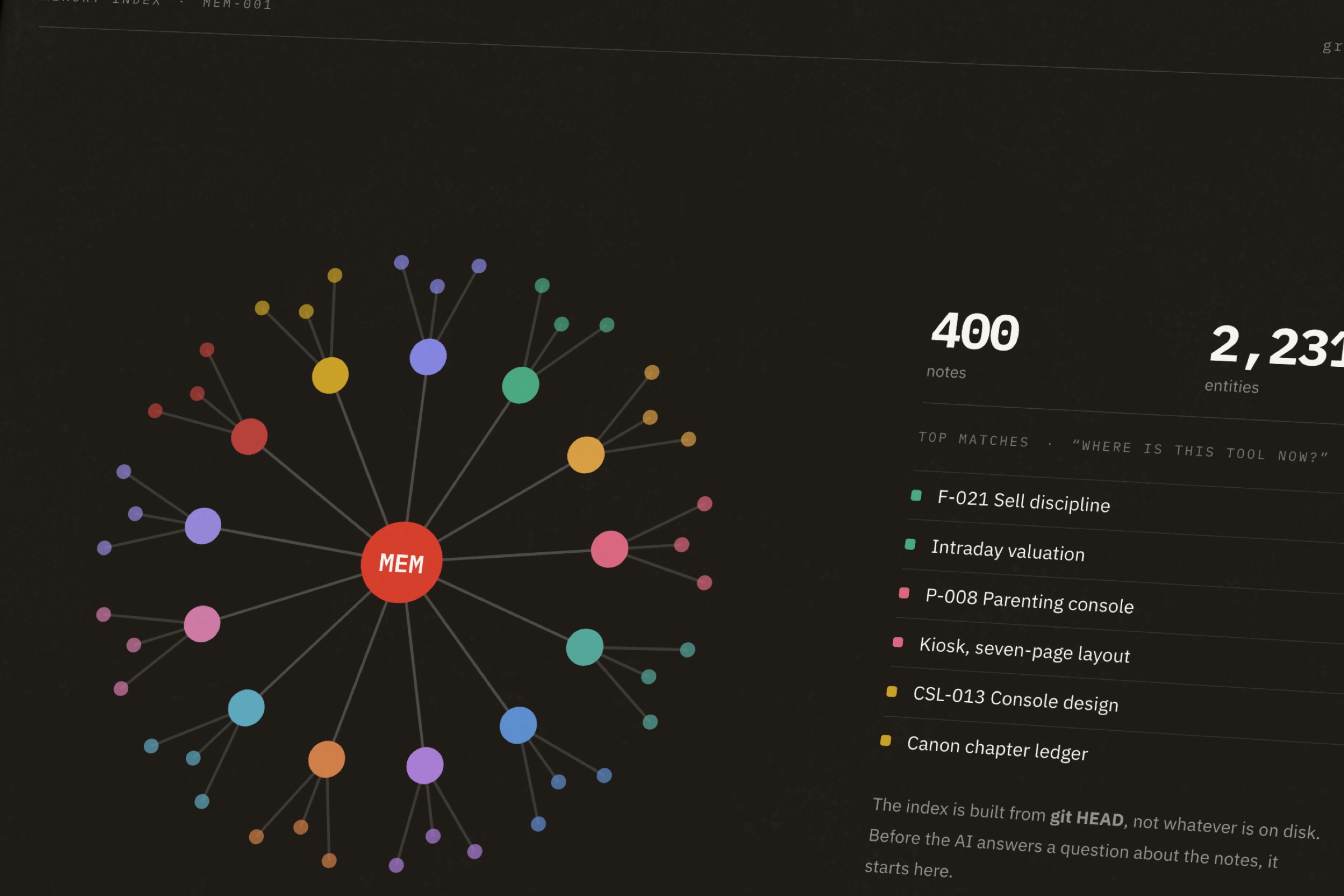
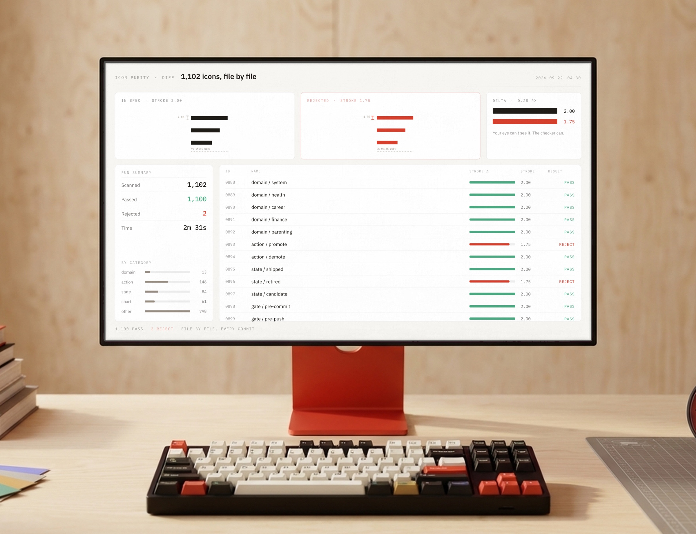
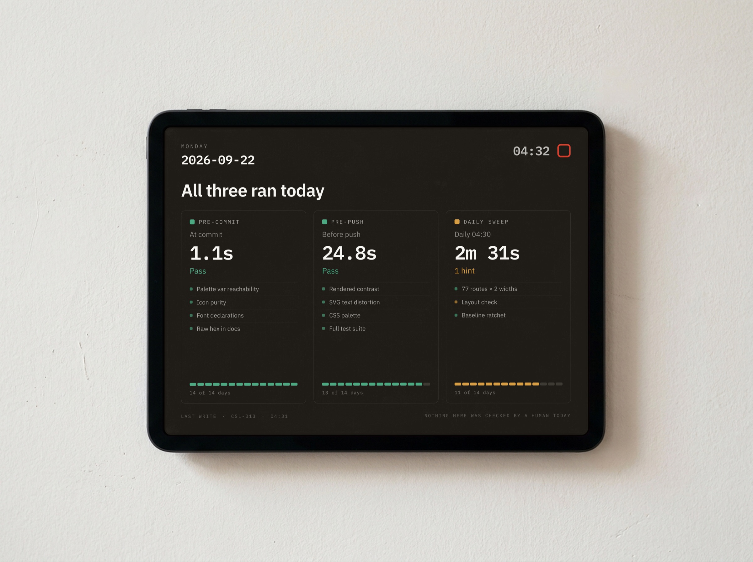
These three run every day: index rebuilds, file-by-file comparison, status on the wall. They aren’t rules in a document. They’re programs that return an exit code.
So how long this lasts doesn’t depend on anyone remembering. When a 14th domain is added six months from now, it will hold that person to exactly the same standard, us included.
06
/06
THE OUTCOME
Deliverables and results
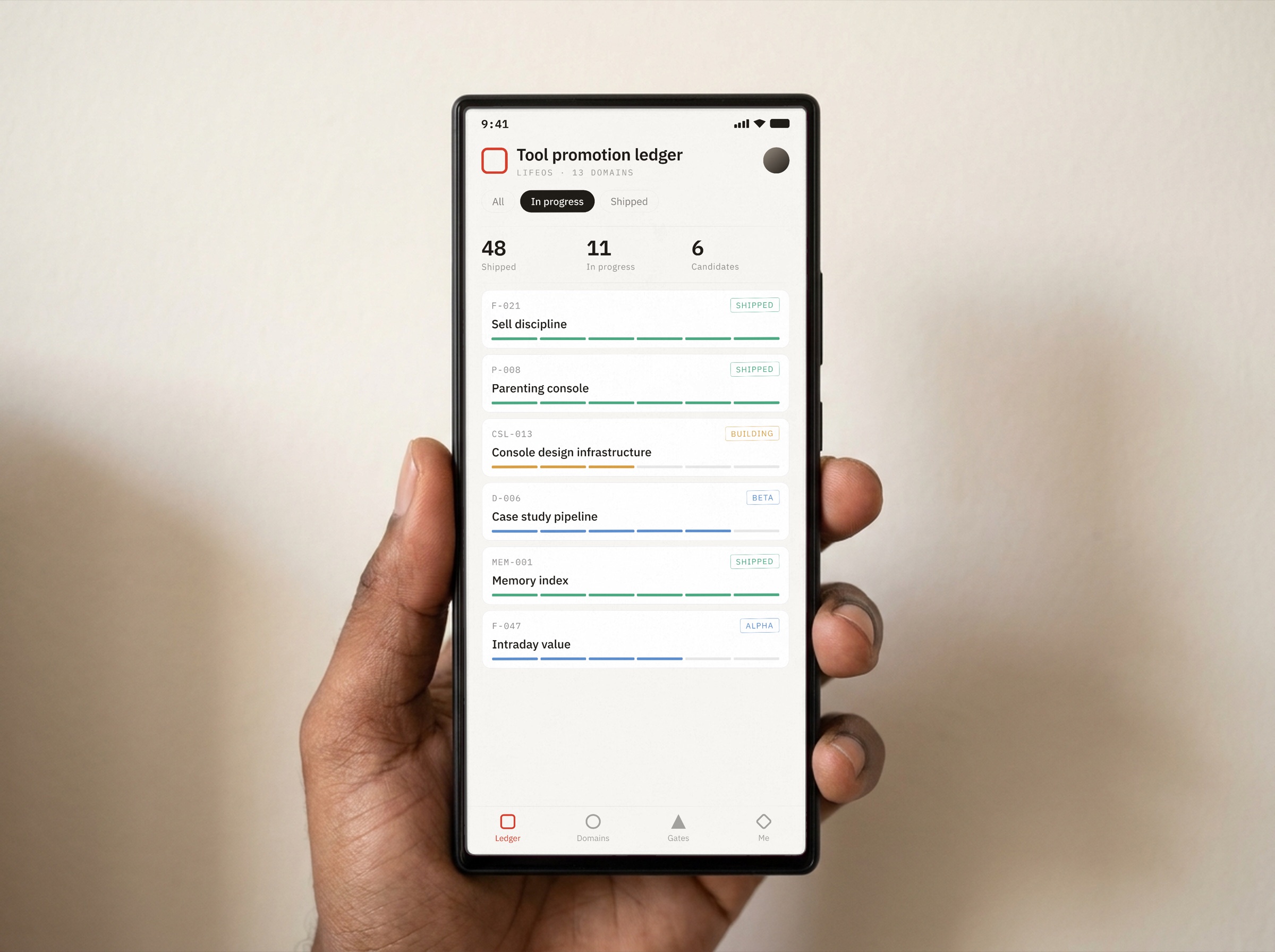
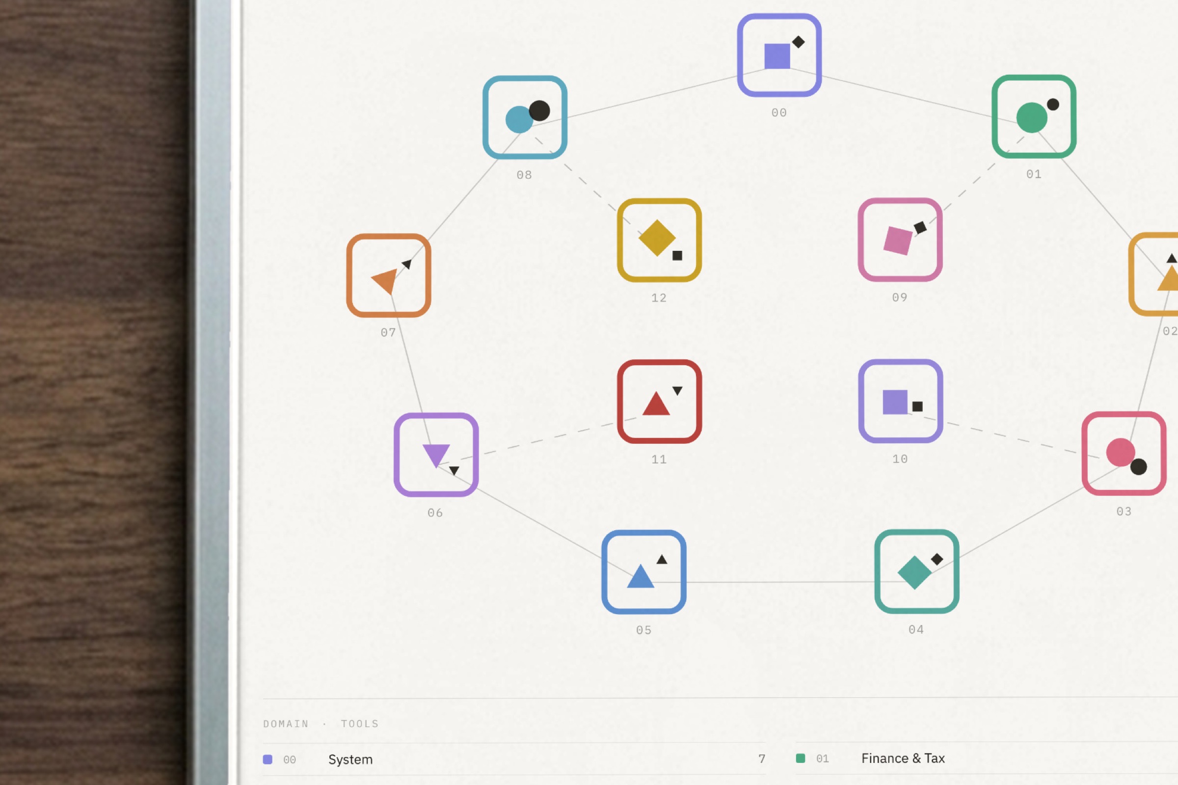
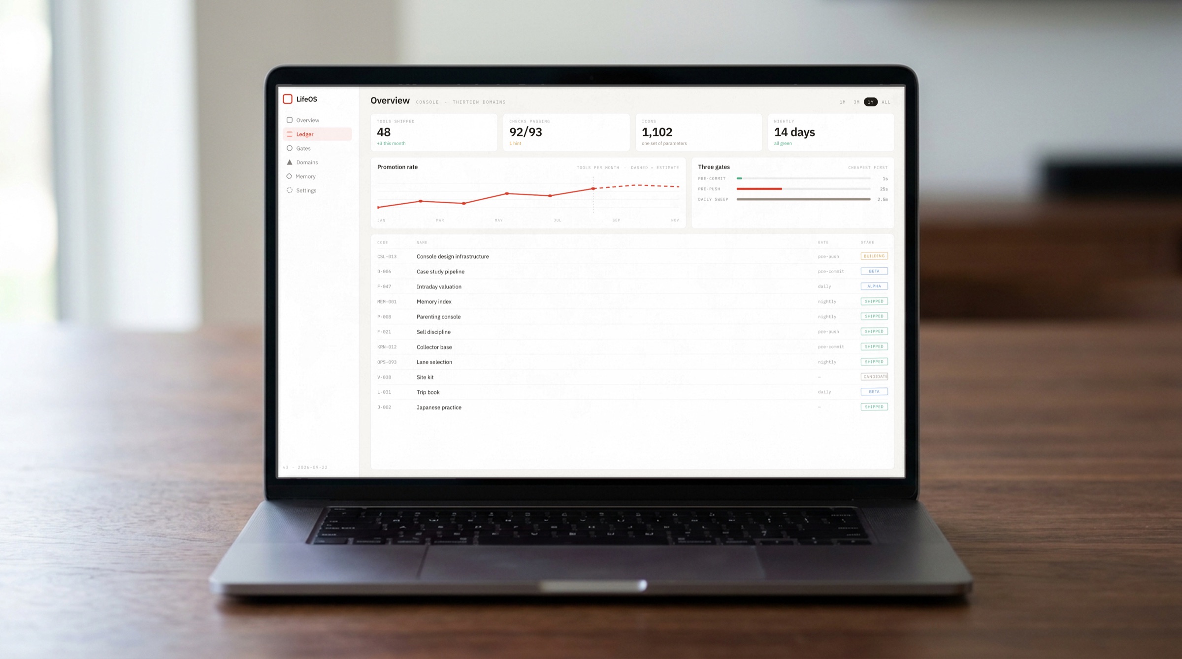
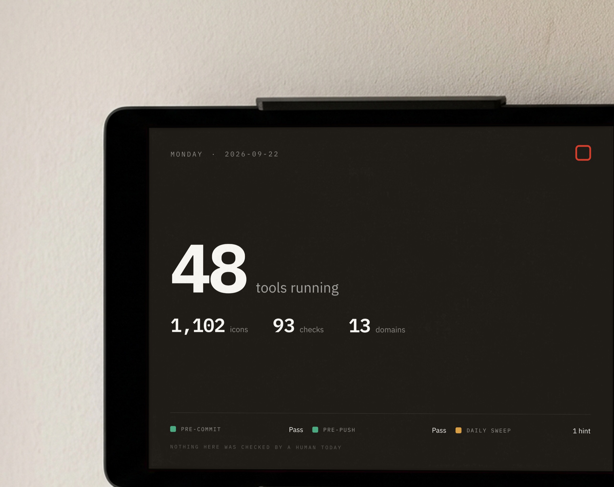
One identity at four distances: in hand, on the desk, at the desk, on the wall. Two are screen close-ups, and even at that scale not a single swatch or type size changed.
What we delivered
Design tokensCSS variables and JSON, generated from the same source. Documents cite variables, not color codes.Icon library and purity checker1,102 icons sharing the same craft parameters. Stroke widths, endpoints and corners checked file by file.Calculated contrast tableCalculated contrast for every swatch on paper and on ink. Anything that fails can’t be used for text.Font slots and self-hosted font pipelineFour slots, three languages, self-hosted woff2 subsets. Change a weight and it reruns once.Eight automated validatorsHooked in at commit, at push and early every morning, so violations can’t enter version control. Another 18 checks were folded into the client’s existing integrity validator.Brand guidelinesThe text explains the reasons and cites variables for values, so it doesn’t go out of date.
ResultsIn use every day. Every commit runs through all eight checkers, and on average they block us once a week. The guidelines became part of the infrastructure.Still in progressOld screens aren’t fully migrated. The guardrails stop new violations, not existing debt. The road is built; we just haven’t finished walking it.
Documents go out of date. Programs that throw errors don’t.
The system on real objects
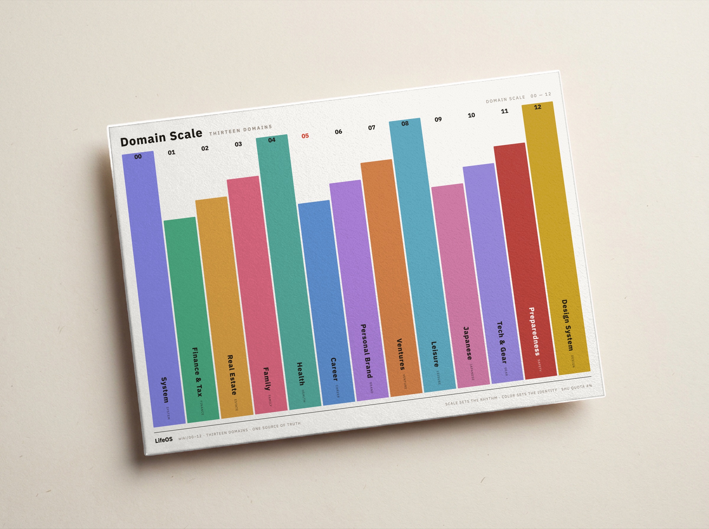
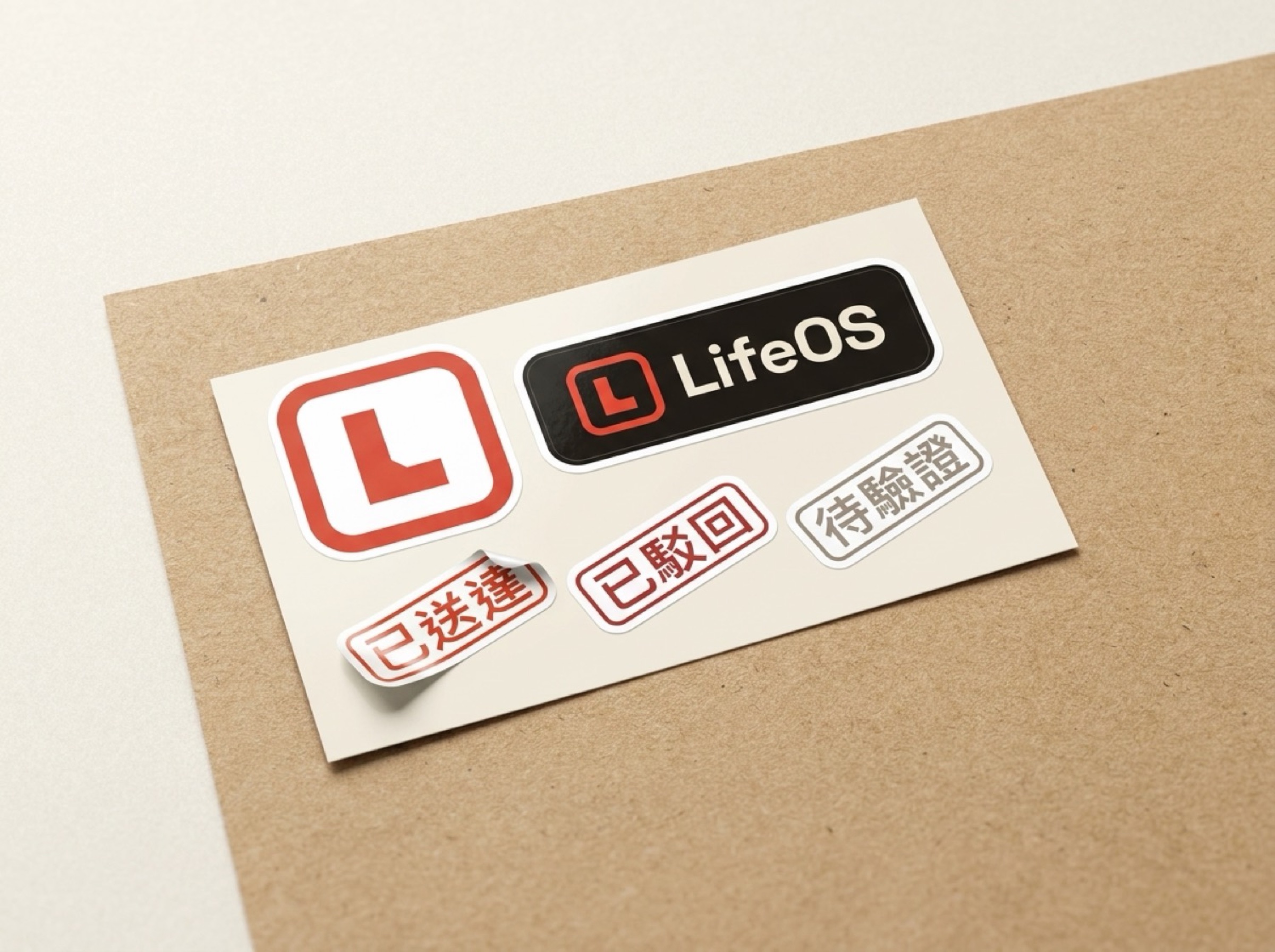
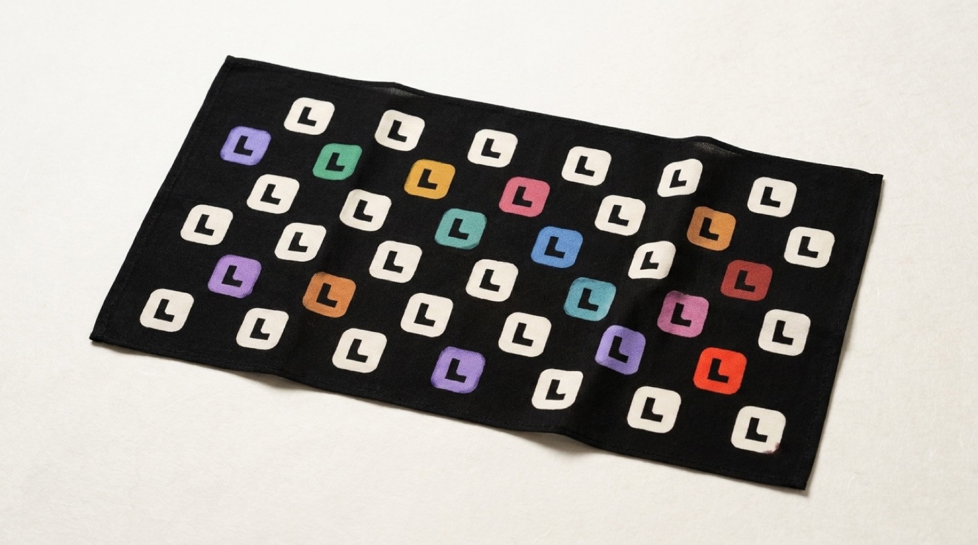
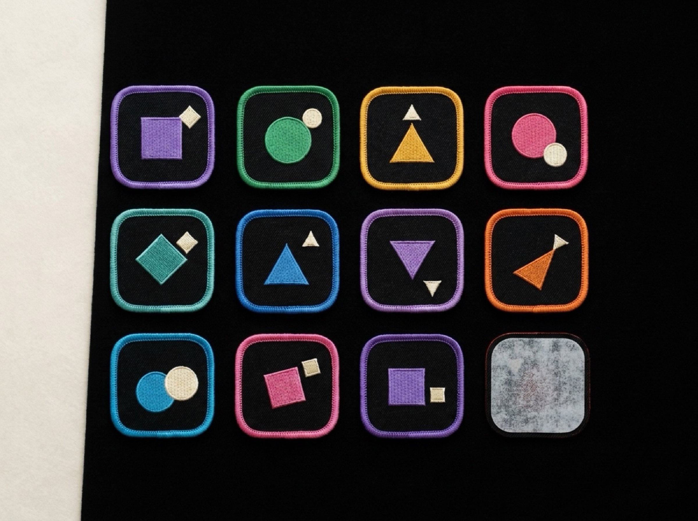
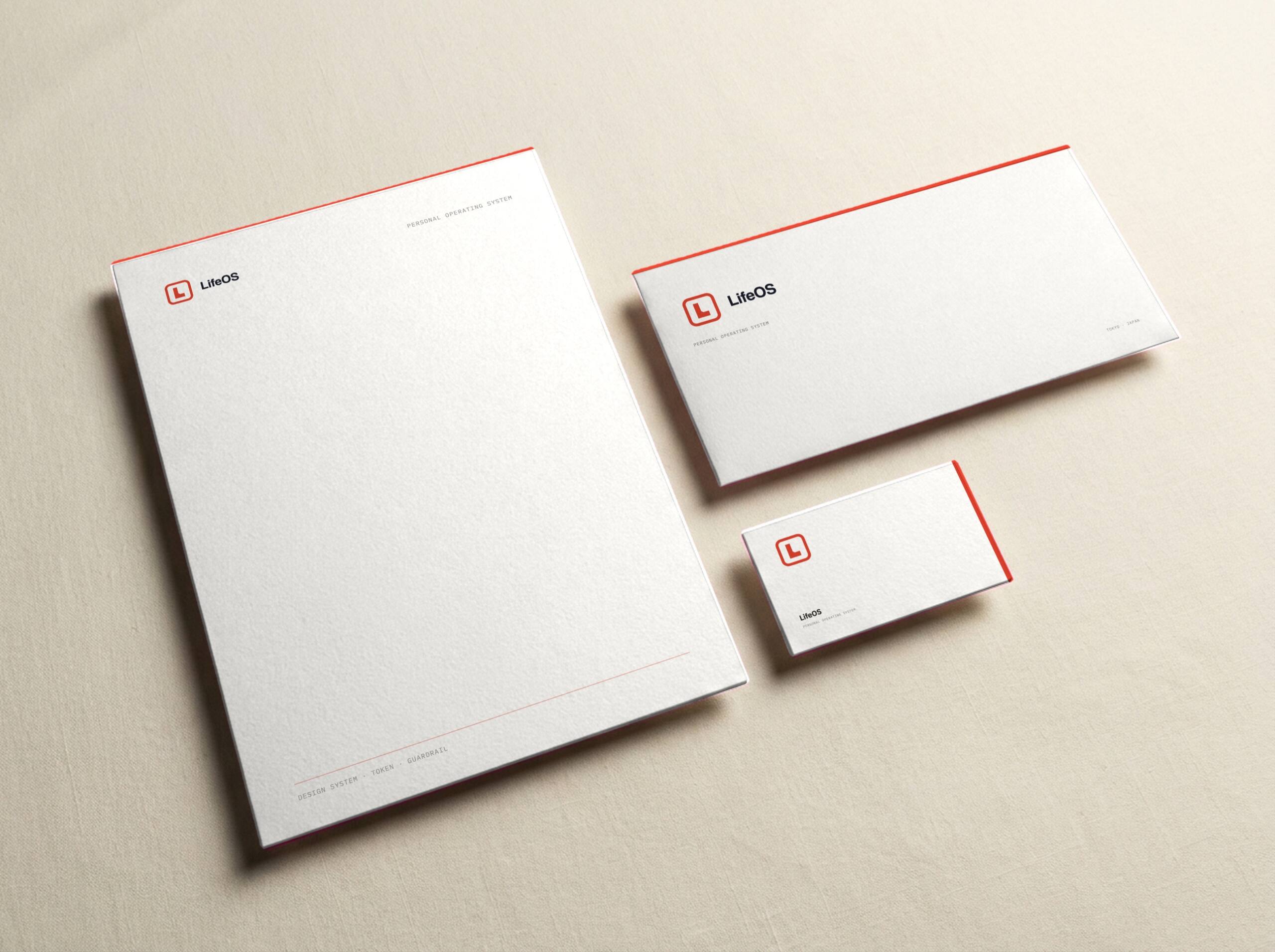
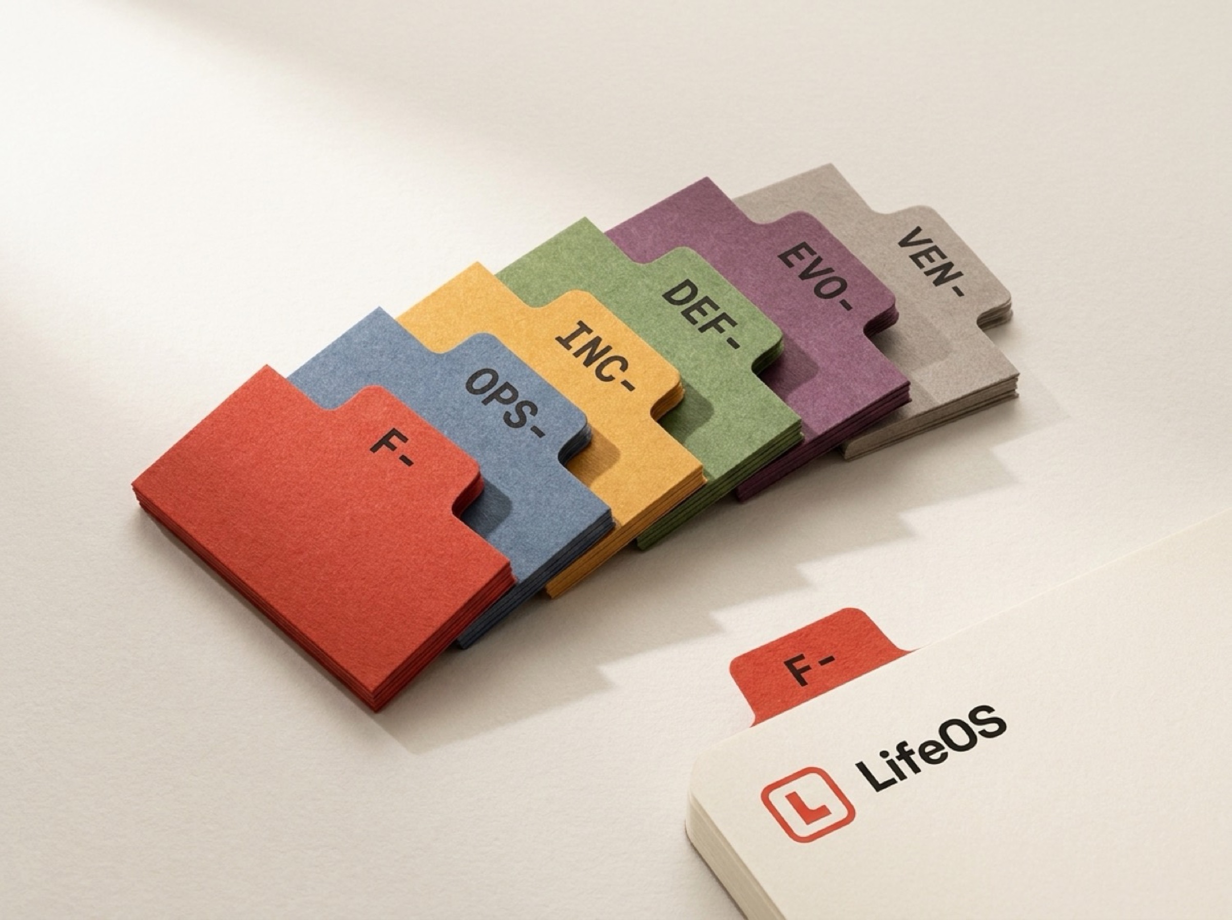
The domain scale on cotton paper, plus stickers, a tenugui, an embroidered patch, stationery and index tabs. Six items in five materials, and not one needed its colors decided again.
Credits
Design & BuildMuzi StudioClientInternal project (not a commission)Year2026SolutionsBrand Identity: strategy, identity, design system, engineering guardrailsDeliverablesDesign tokens, icon library and purity checker, calculated contrast table, font slots and self-hosted font pipeline, eight automated validators, brand guidelines