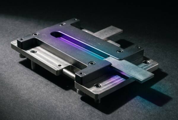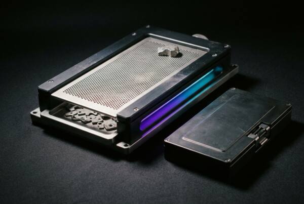

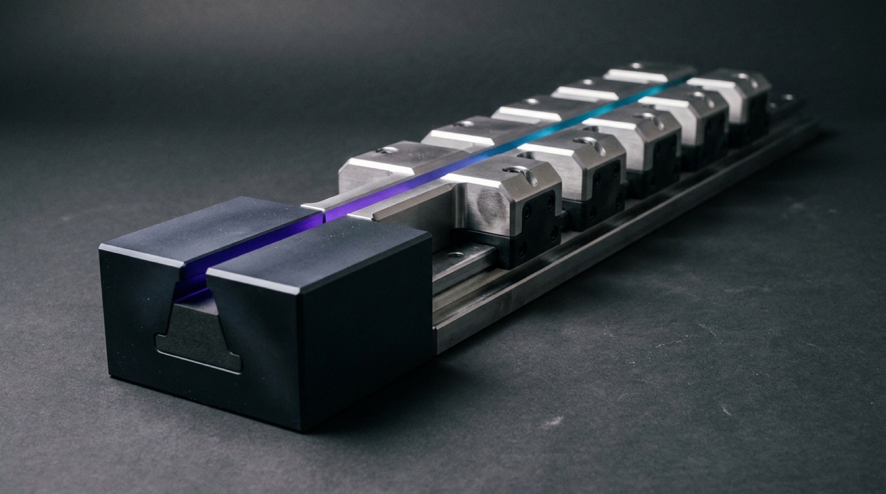
The most common way to fail at a full set of visuals from a generative model is to carefully rewrite the prompt for every image.
However well each one is written, the images still drift from one to the next. If you describe the same thing from scratch every time, the wording can’t come out the same every time.
The two things that helped
One is locking the style paragraph. Light, color, material, contrast and the feel of the lens go into one fixed block of text that every image uses, unchanged down to the word. The only line rewritten per image is the subject.
The other is reference images. Feed in the palette and the approved assets directly as input instead of describing colors in words. Color described in text is the least stable link in the whole process.
With those two in place, we went from “every image is different” to “now and then one gets thrown out.”
What should repeat is the quality of the light
Our first version spelled out the lighting rules very specifically. Of a few dozen images, half used the same lighting setup.
Seen together, they didn’t look like a set of assets. They looked like one filter applied a few dozen times.
So we split the rule into two layers. The quality of the light stays fixed: cool, dim, and visibly landing on something. Where the light comes from rotates from image to image: leaking through a gap, falling on a wall, passing through frosted material, glinting off metal.
The set still gets its identity from repetition. We just changed what repeats.
What we don’t generate
We don’t generate faces to stand in for our team or clients, and we don’t generate interface screenshots to stand in for real projects.
Generated images handle mood and material. When something needs proving, we use the real thing. One “client case study” that someone spots as generated casts doubt on the real work sitting next to it.